
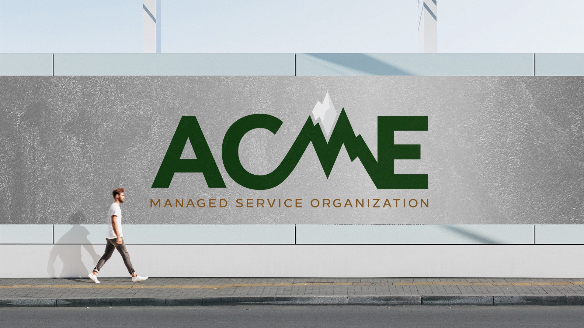
Before there was ACME, there was AWT (Advanced Wound Therapy). They were clients that we had built brands for before and like any growing business, they continue to solve problems in their industry by providing solutions that nobody else is. ACME is a Managed Service Organization that was developed by identifying a need in their industry. ACME means “The point at which someone or something is best, perfect, or most successful. The summit; peak: the highest point of attainment of something.” So our objective was to build a brand that reflected the level of service excellence that ACME was bringing to the medical industry.
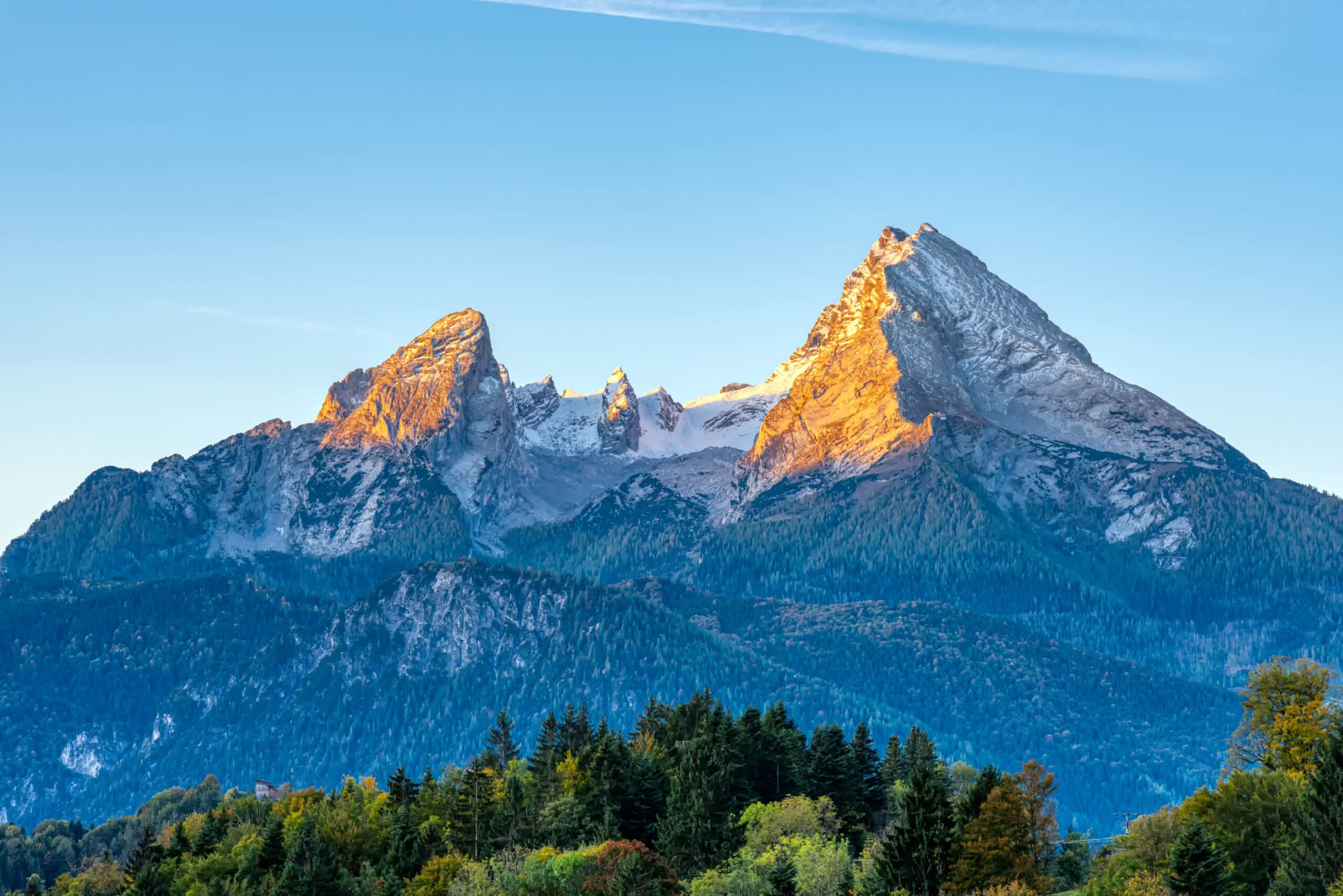
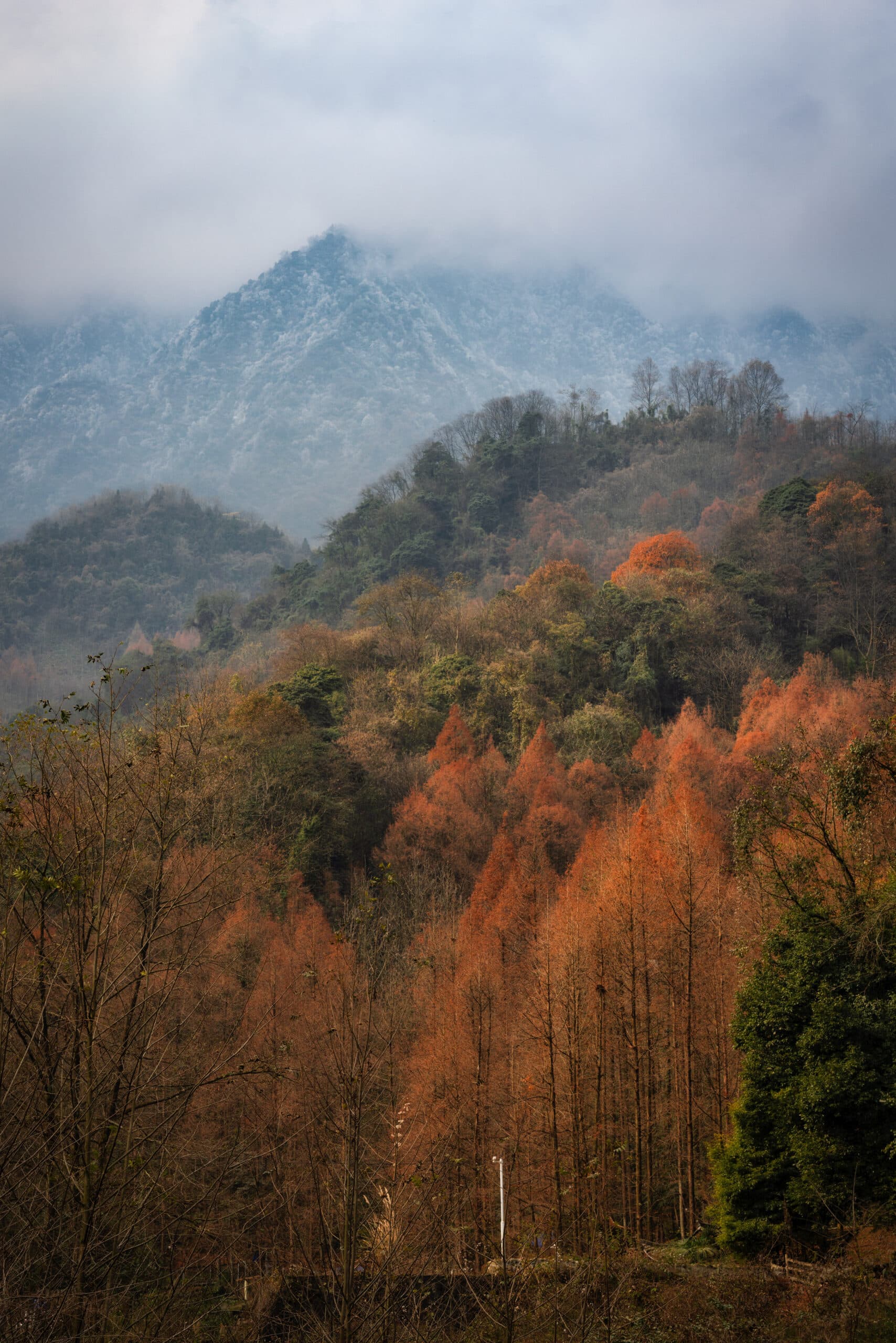
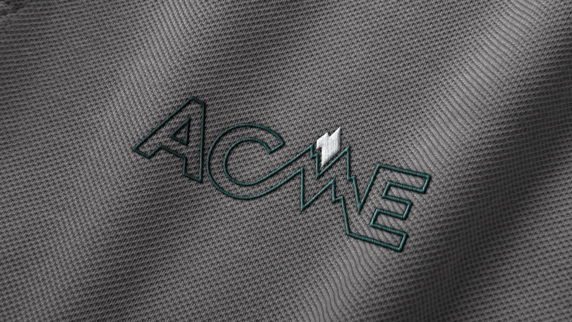
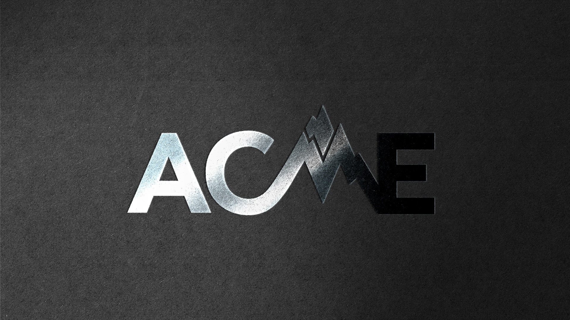
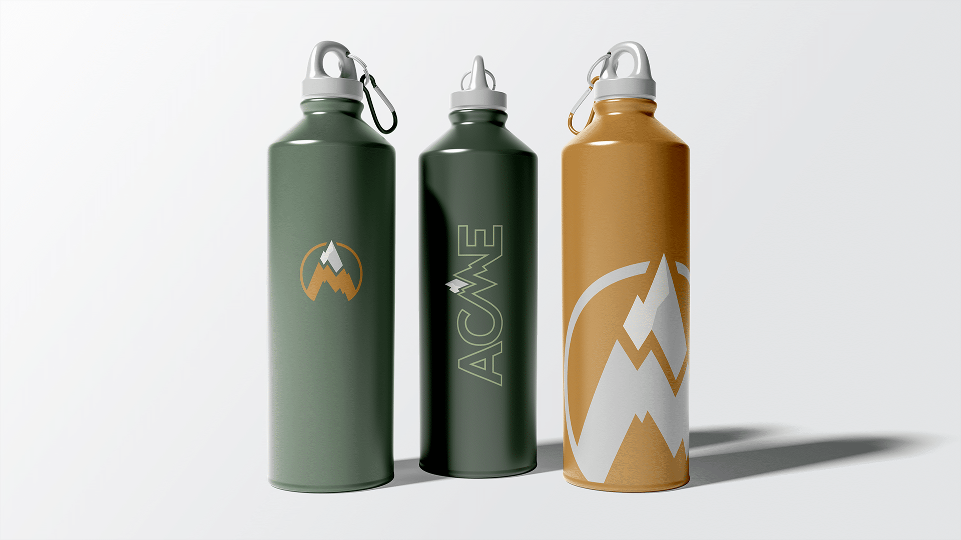
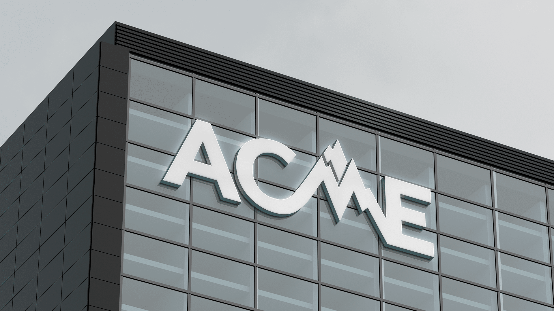
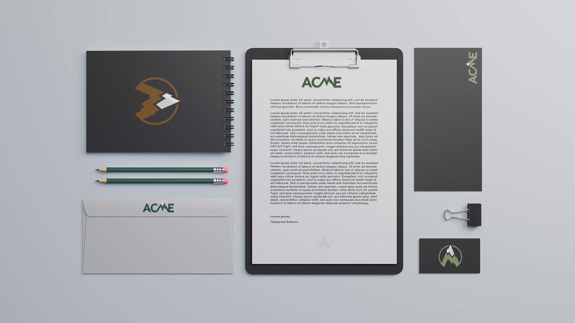
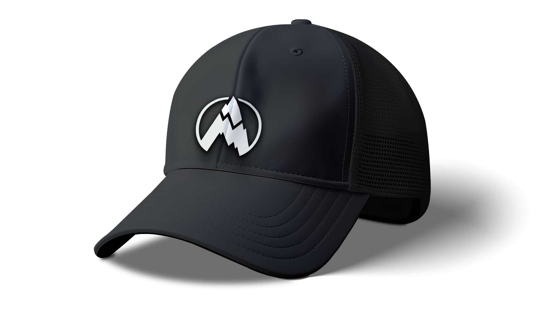
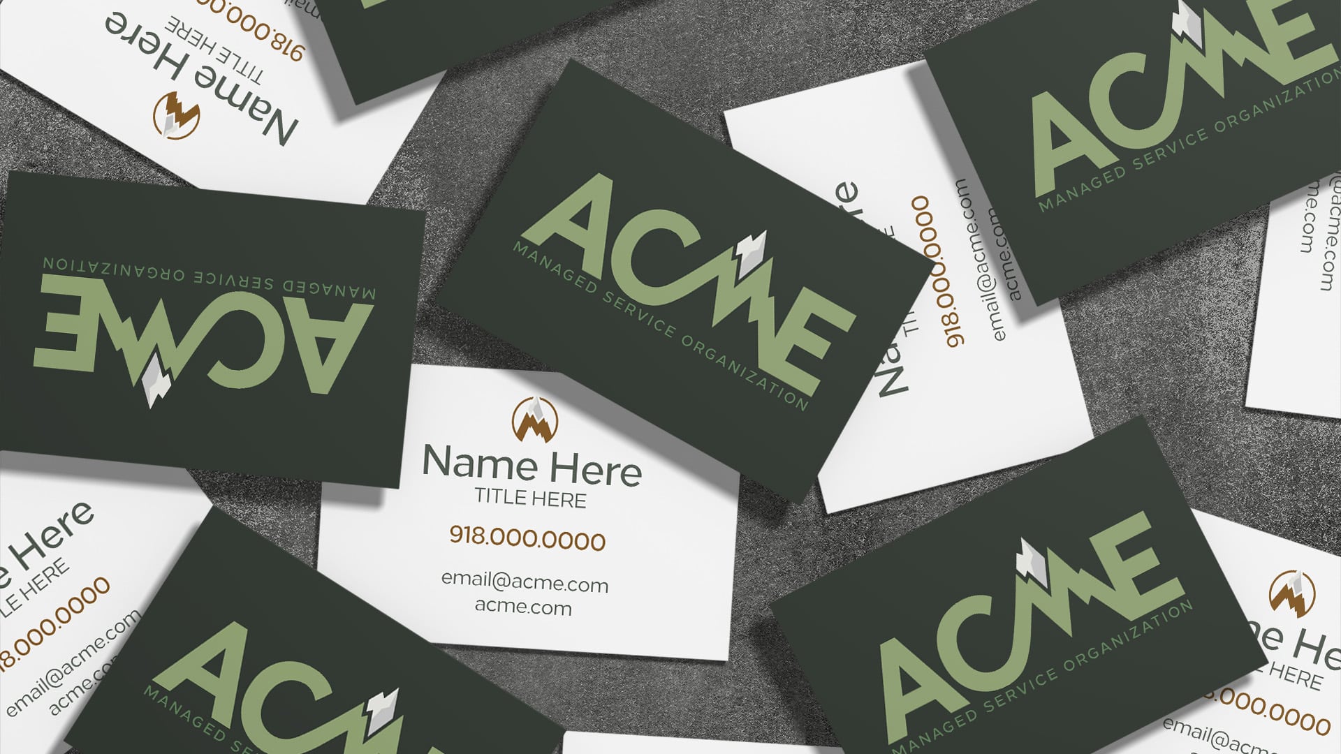
The brand construction always starts with brand research.. We drew the initial icon conceptuals from ACME’s definition, by reforming the “M” as the mountain and summit and connecting it to the rest of the company name. In order to bring focus to both the “M” in ACME and the summit, we separated the summit from the top of the “M” and color separated the super faces for depth. The Icon as a stand alone was reconditioned as the “A” in order to better connect the Icon to the company name. The designated primary logo for ACME includes the messaging “managed Service Organization” underneath. The color palette was chosen to further drive home the mountain and its peak while also pointing back to the CEO’s love for the outdoors.