

Real Estate is the biggest purchase or investment that most will make in their lifetime. Keira wanted a way to visually distinguish herself from her brokerage in order to take on a more elevated persona. For most, buying a home is intimidating and full of details that can mean the difference of thousands of dollars. Having a realtor that you can trust is essential when taking that step. Keira’s brand needed to tell prospective clients that she is a realtor that cares about the details, that is established and ultimately, an expert in her field. A realtor that could be trusted.
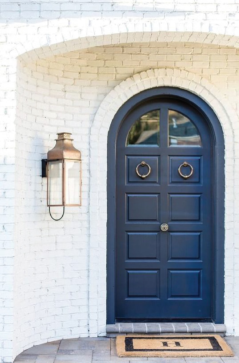
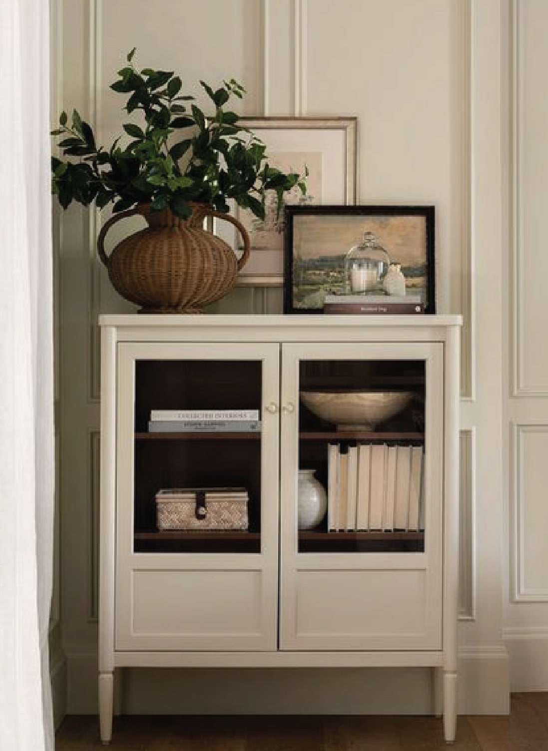
Keira’s brand was built to be elevated and clean, with simplicity at its core. We designed for high legibility as a lot of realtor brands are seen on signage while driving by. We selected colors that would reflect her style and culture. Navy blue was selected because it speaks towards authority, stability and reliability; the things that you look for in a realtor; while the tan represents warmth and comfort; the things that you look for in your home. Overall, her brand needed to tell people, not just who she was and what she did, but how she did it and separated her from other realtors.