The purpose of rebranding Avitrol was multifaceted. When we initially met with them, we found that they had 3 active brands living on everything from social media and their website to their product labels. The bigger problem that they were having was solving an overall messaging problem in regards to the products and services that they provided. A rebrand was the simple solution to both.
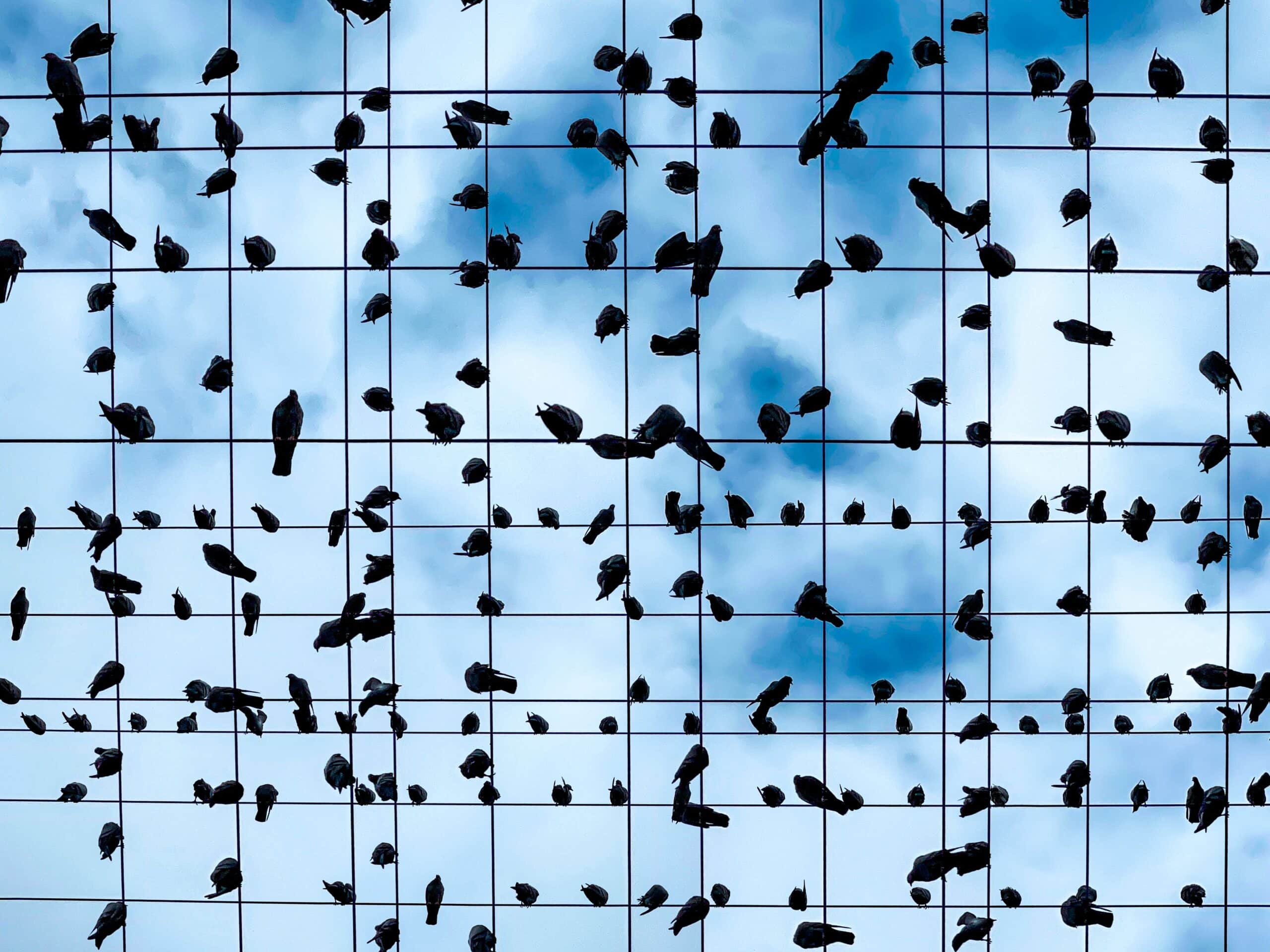
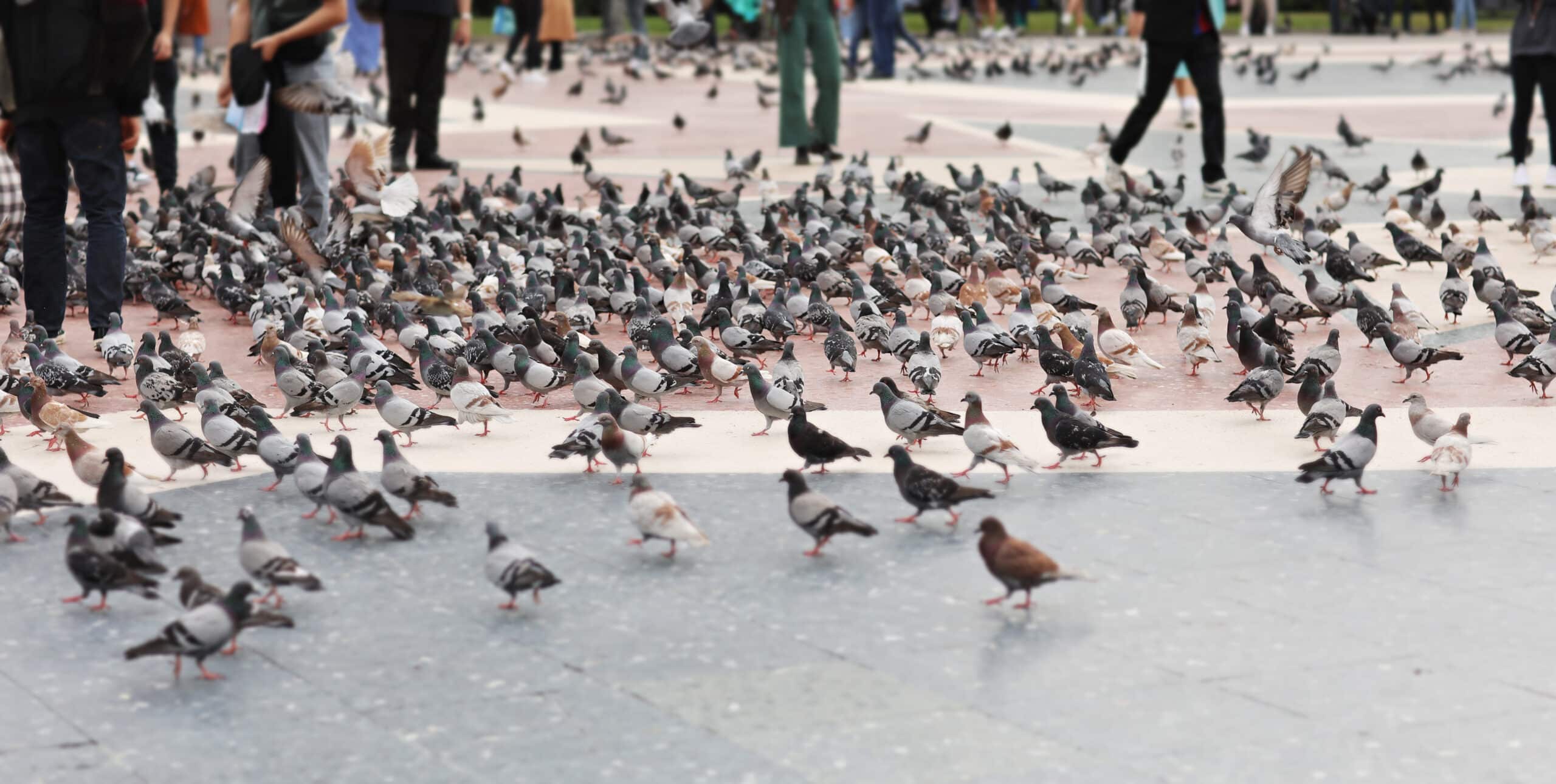
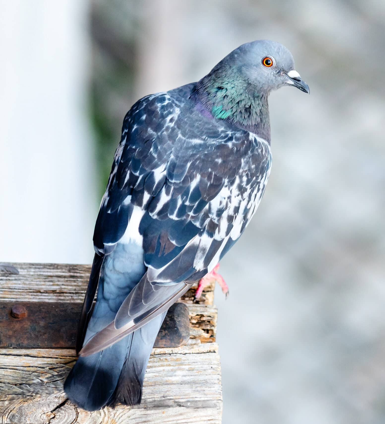
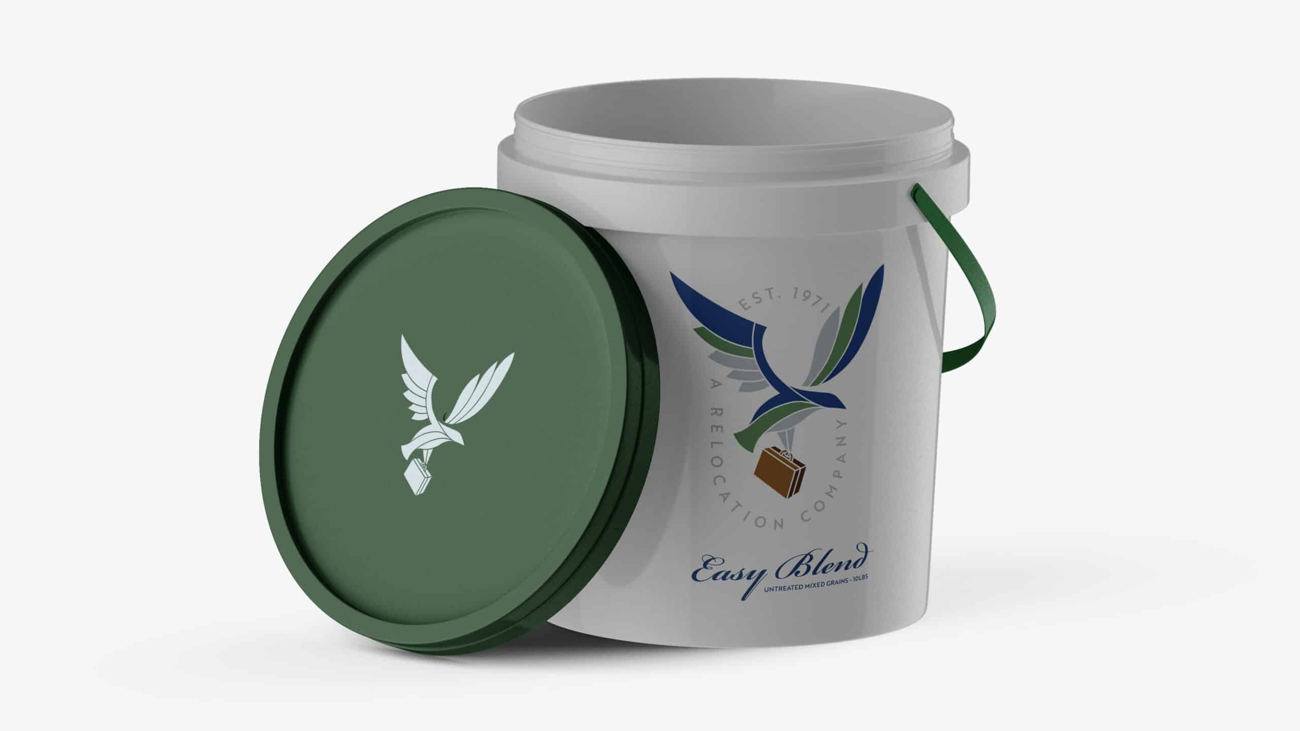
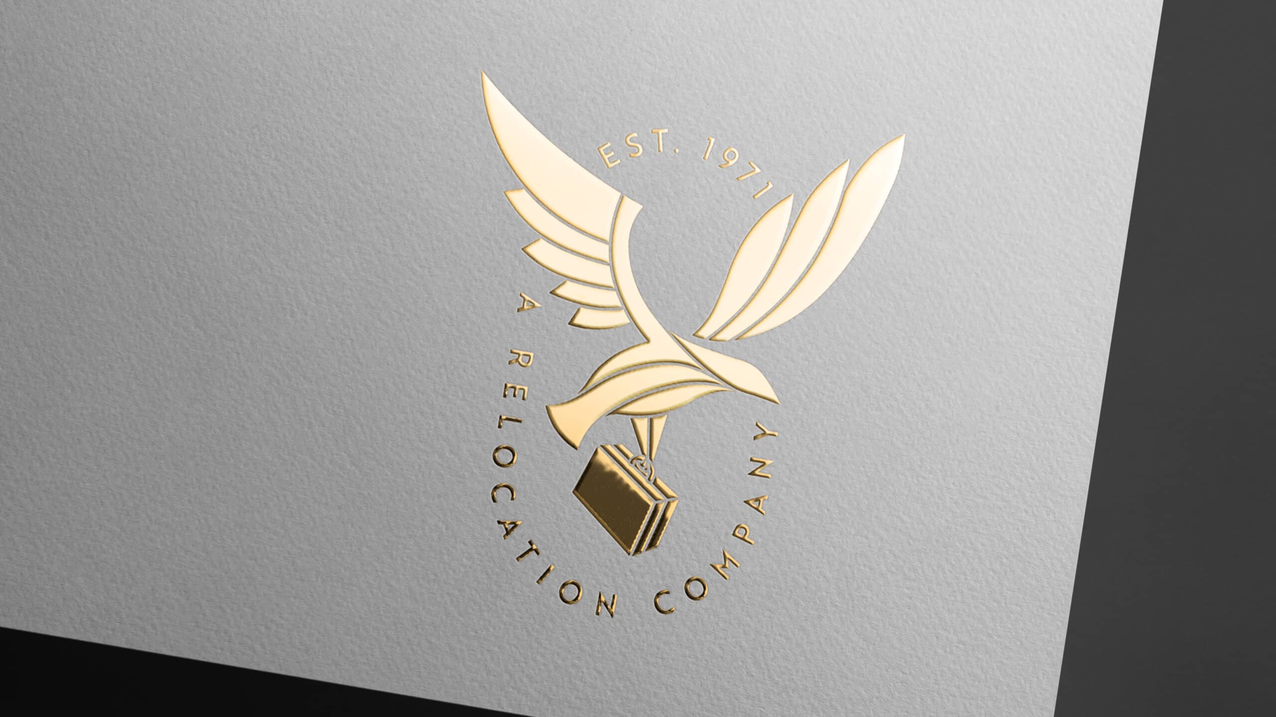
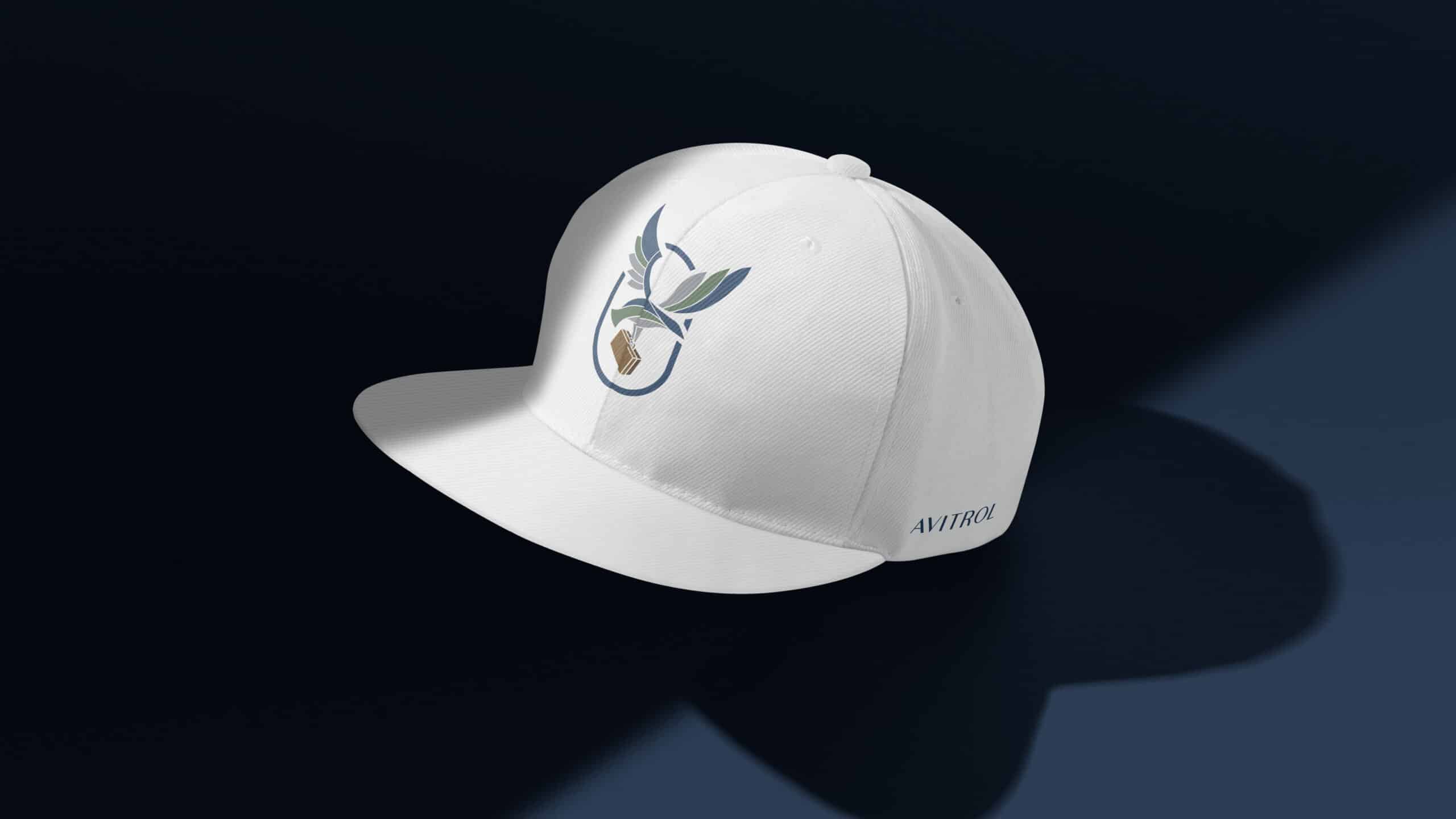
Our thought process was to take the general idea that “Pest Control” meant extermination or harm to the animal causing the problem and to communicate that Avitrol was a company that simply pushed birds (the pest) out of human populated spaces back to their natural habitats. Our goal was to eliminate assumptions that one might have due to miscommunication or the lack thereof. We designed the Icon to visually communicate the end goal of Avitrol in “relocating” the birds instead of eliminating them. We designed an elevated and clean lined bird carrying a suitcase to visually and playfully point towards the bird packing up and moving and then added the sub-messaging to their primary logo “A Relocation Company”. Avitrol is not just a pest control company, but also developed the technology necessary to produce the products needed to do the job. We chose the typography in an effort to lean towards the clean lines and structure of the technology space. The color palette was selected to connect the client to the CEO’s love for nature and the effort that they are putting forth to become the foremost experts on birds and their natural habitats. The palette reflects the colors of nature, from the ocean’s deep navy to the sky blues, to the various greens of the deep forest. Avitrol’s passion to protect birds and other wildlife by keeping them out of populated areas will ultimately make the world a better place for both humans and nature.