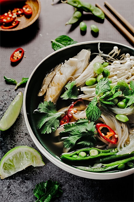
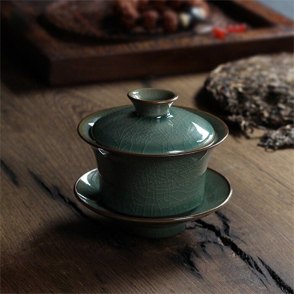
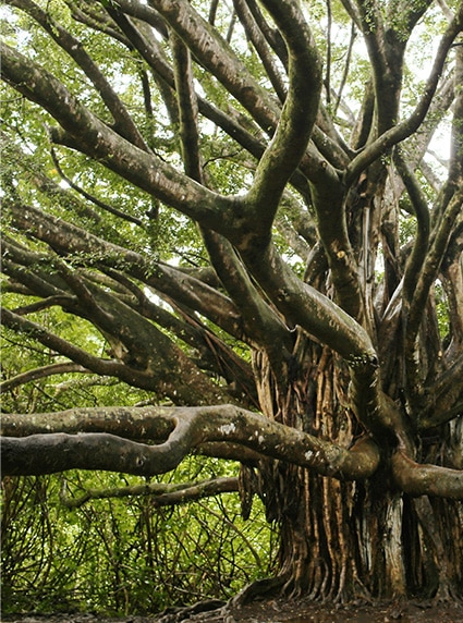

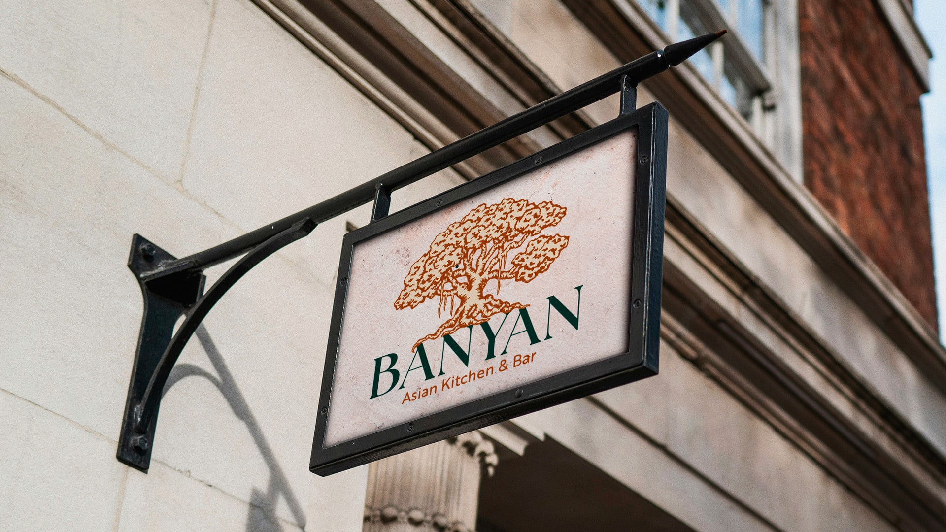
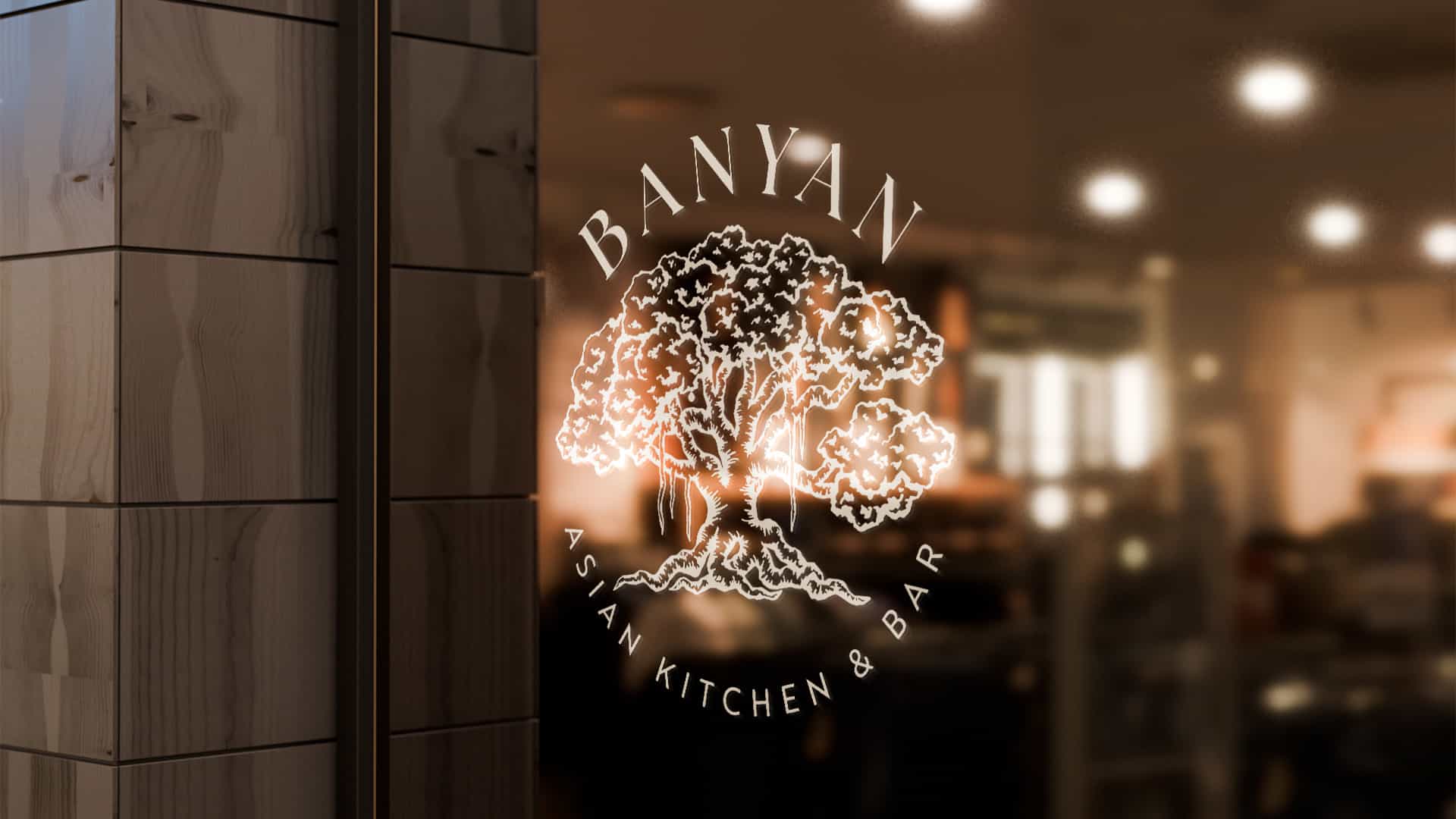
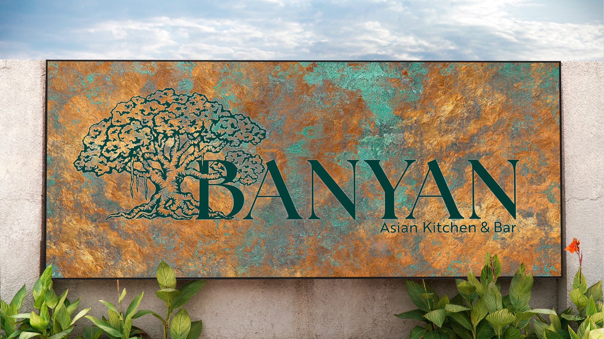
We had previously worked with this client on the brand development of a different restaurant. They wanted to bring something unique to Tulsa with a dining experience that was both elevated and imaginative. The concept that they brought to us stemmed from the Banyan Tree; a tree that is unique in structure with an overwhelming and undeniable presence. The task was to develop a brand that paired the organic and haphazard nature of the Banyan with the elevation, refinement and elegance of Asian culture.
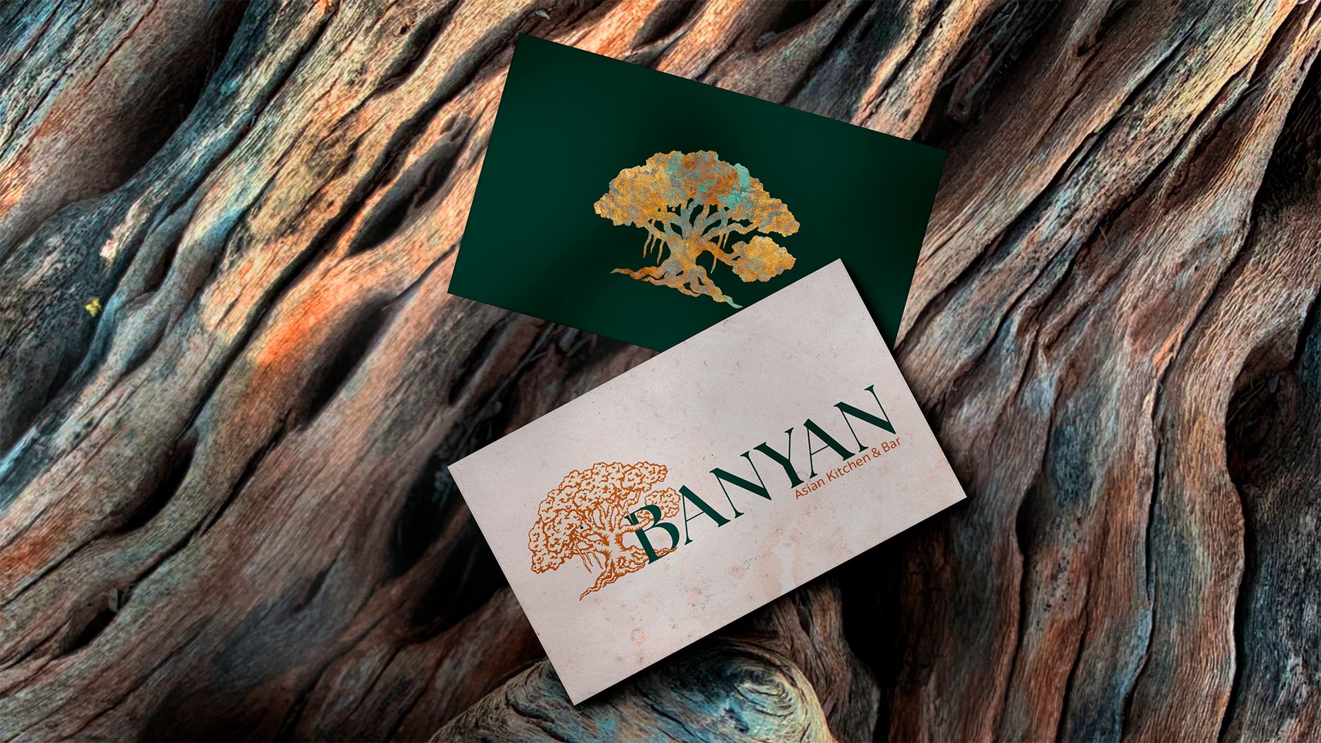
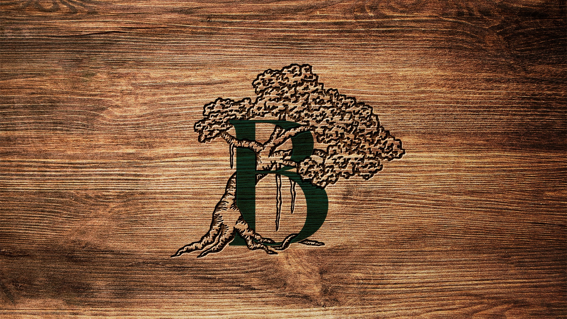
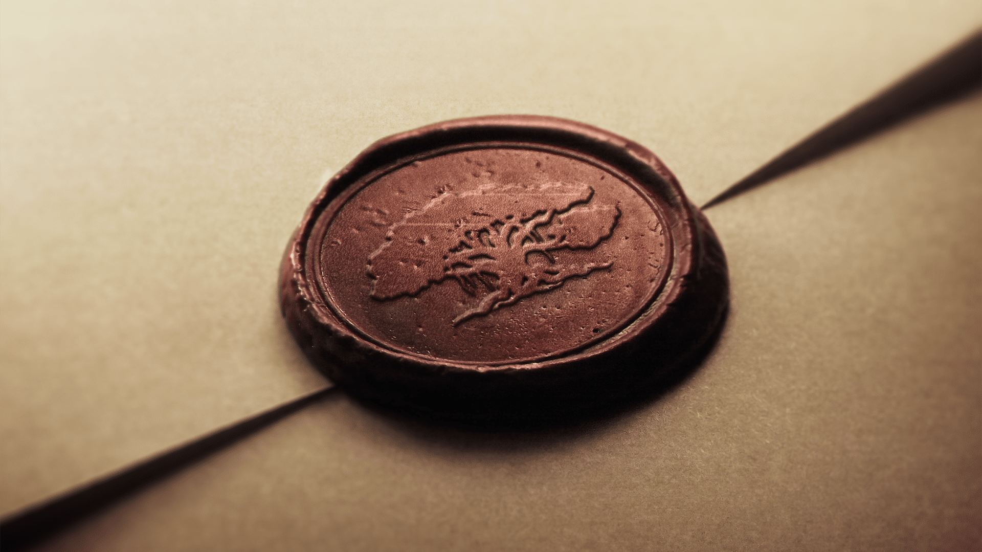
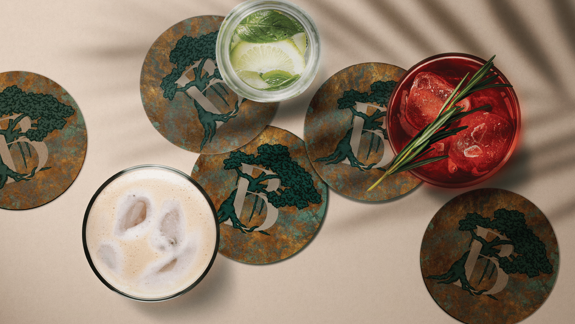
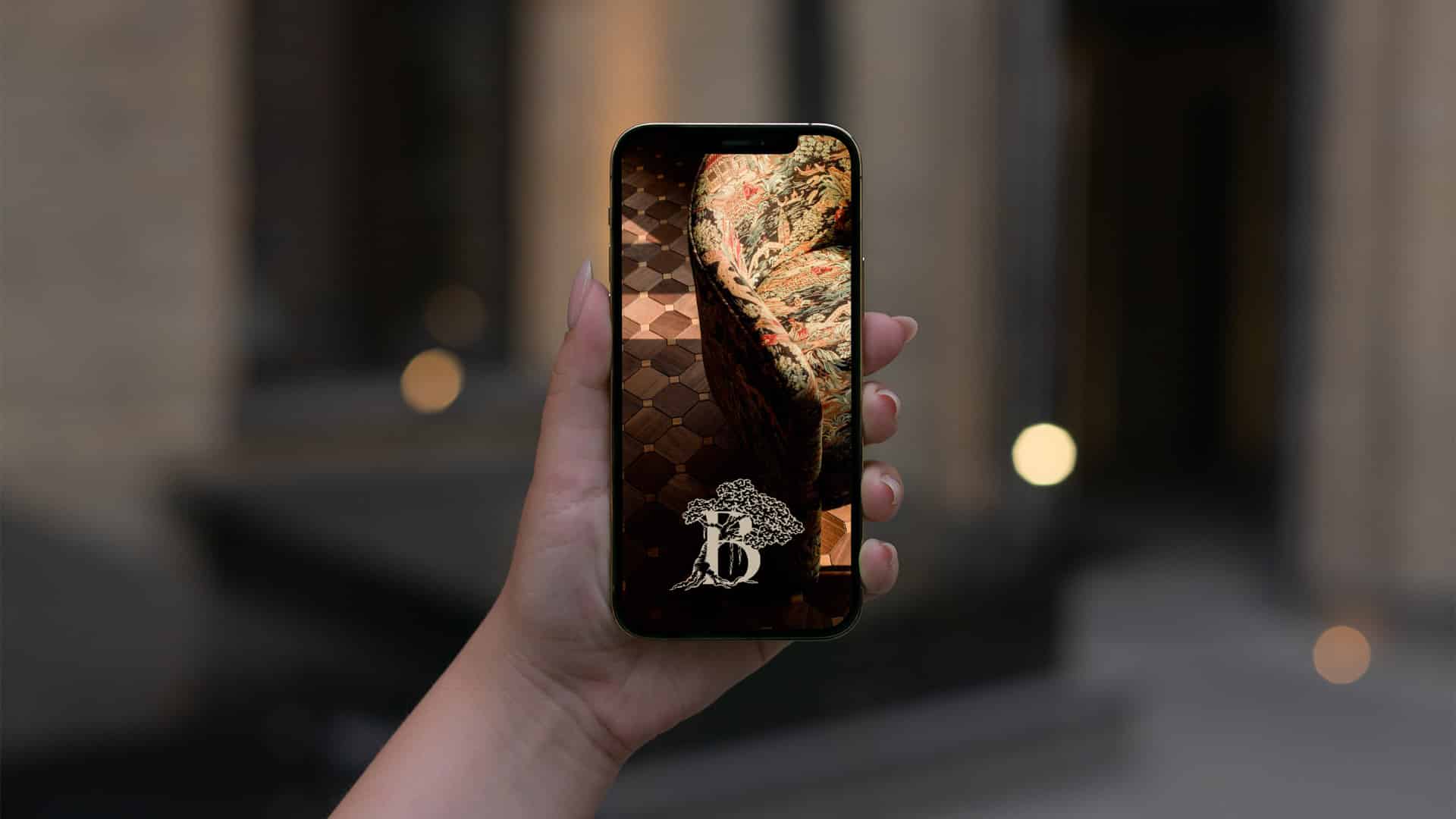
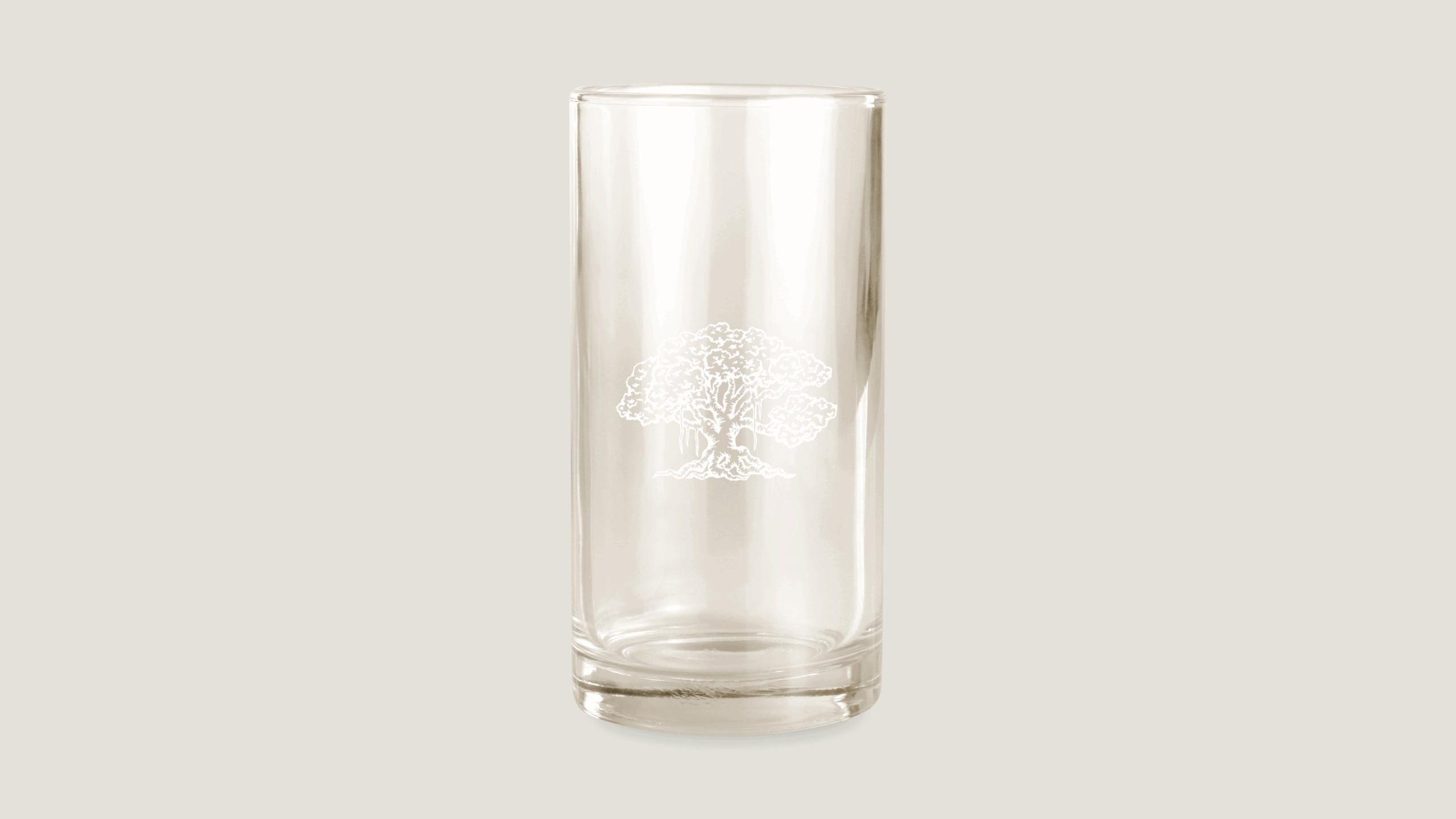
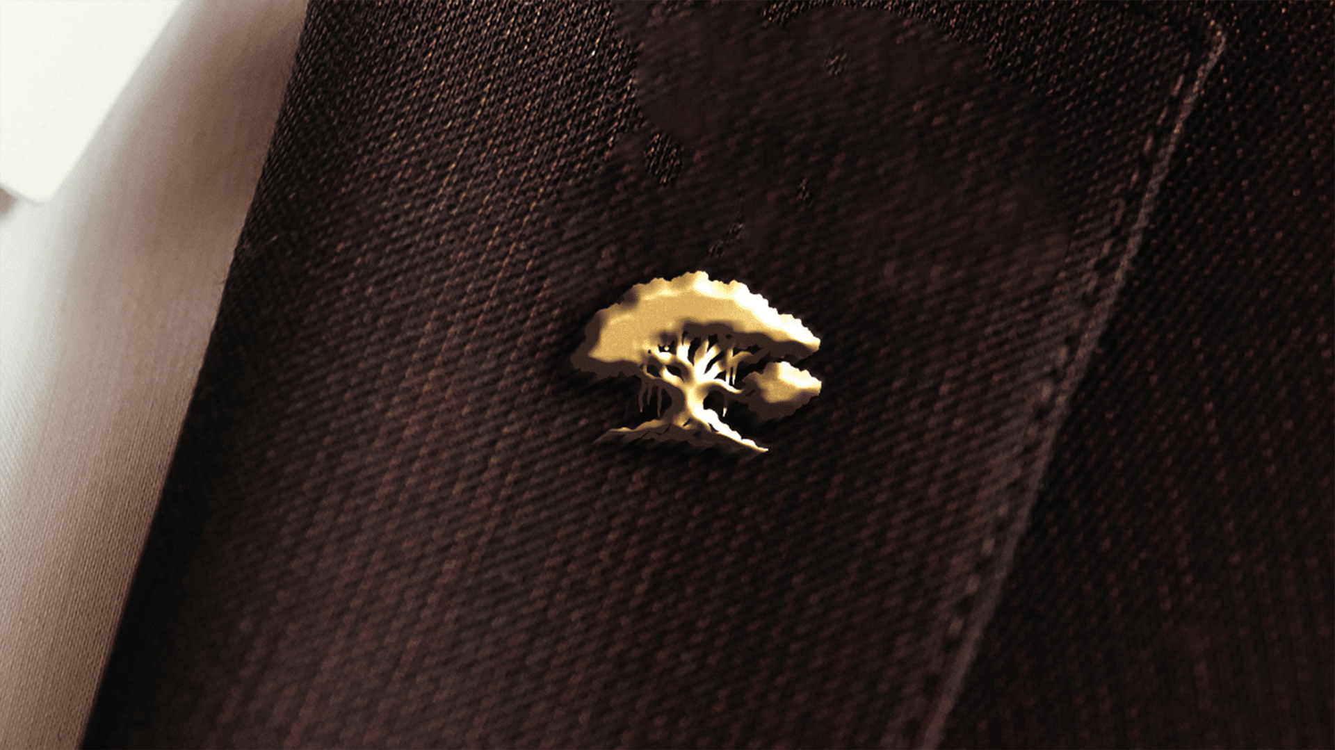
This logo began with the icon development. The hand sketched Banyan Tree was built to bring an organic, natural but unpredictable element to the otherwise clean and elevated branding of the restaurant. The typography was chosen to contrast the organic feel of the Icon with the stability and reliability of the overall brand. The strength of the serif font brings an authoritative, professional and historical aspect to the logo. The sub-text was chosen to create an edgy but substantial foundation. The color ways of the logo were chosen to establish an organic elegance while highlighting the most primary text. The primary logo is stacked in order to draw the eye to the fullness of the logo as a single entity.