
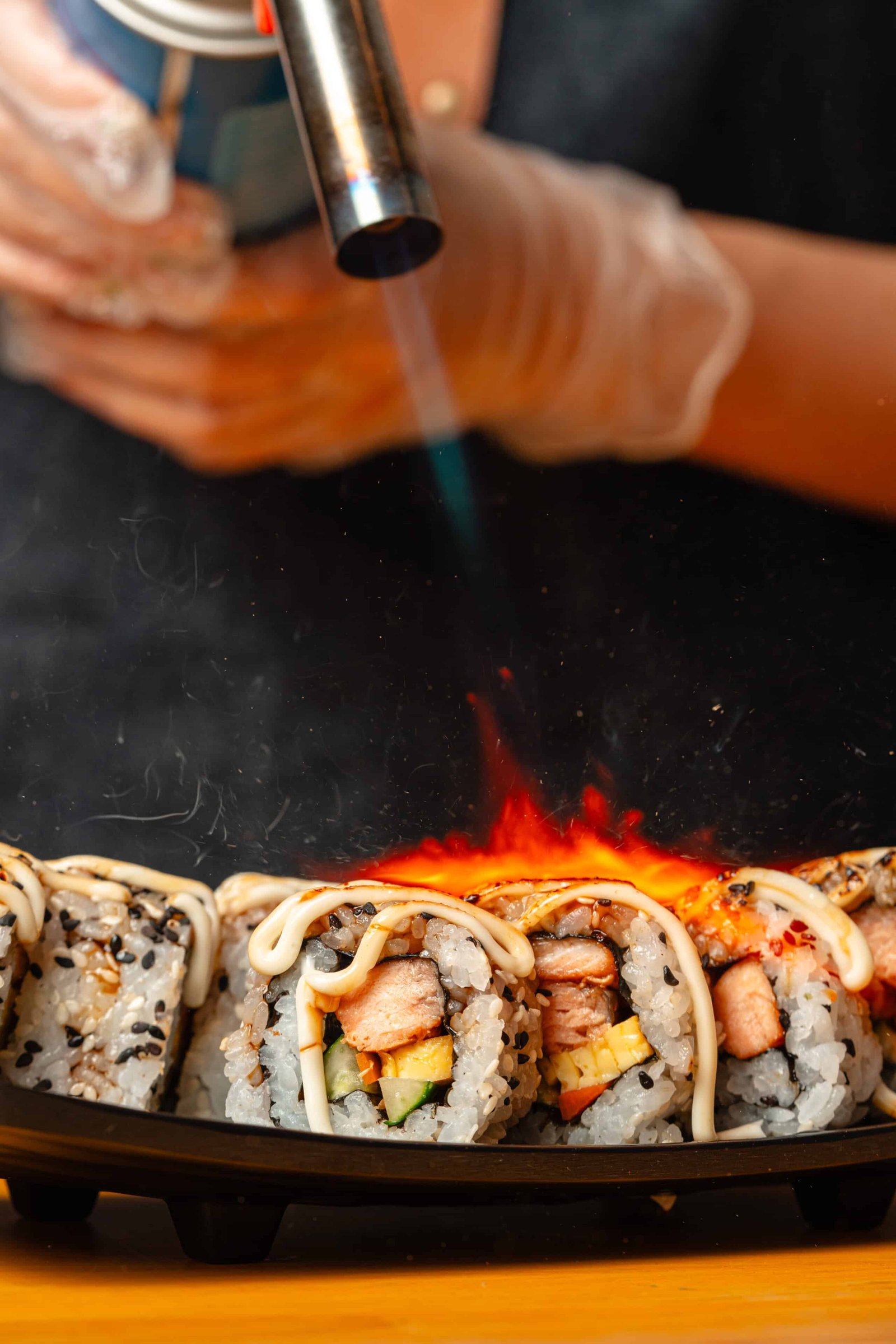
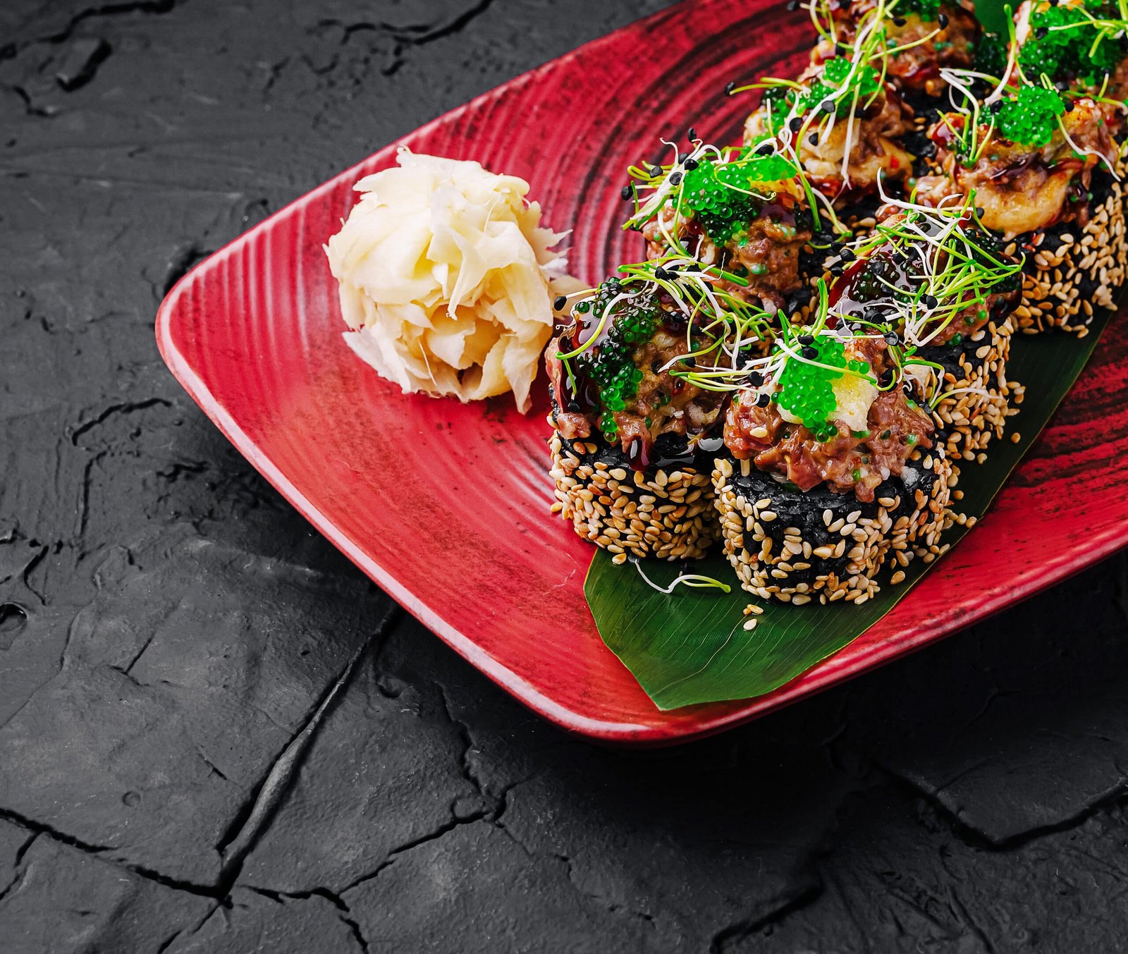
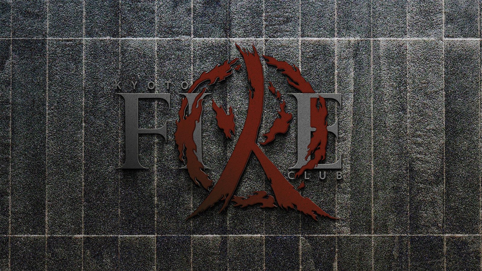
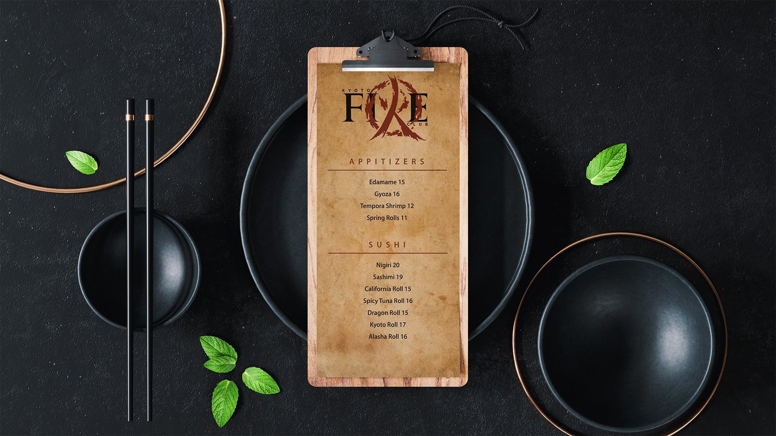
Kyoto Fire Club is all about the experience. The food is part of the overall experience, but experiencing the other subtleties of the brand through your time at Kyoto Fire was the objective here. Kyoto Fire means to take the dining experience to another level by transporting culture, customs and cuisine to your dining table.
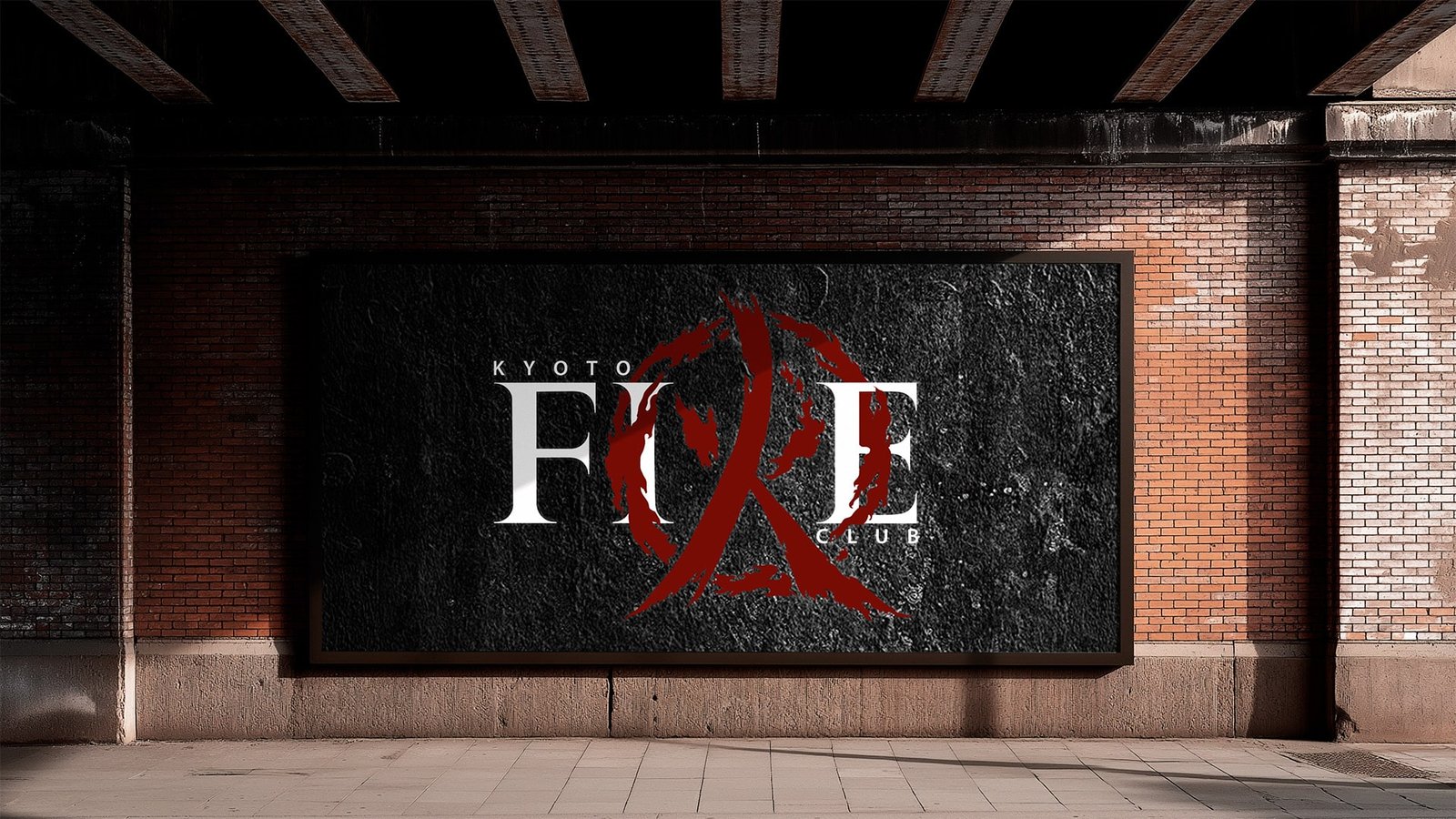
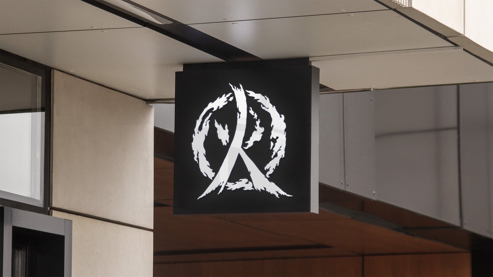
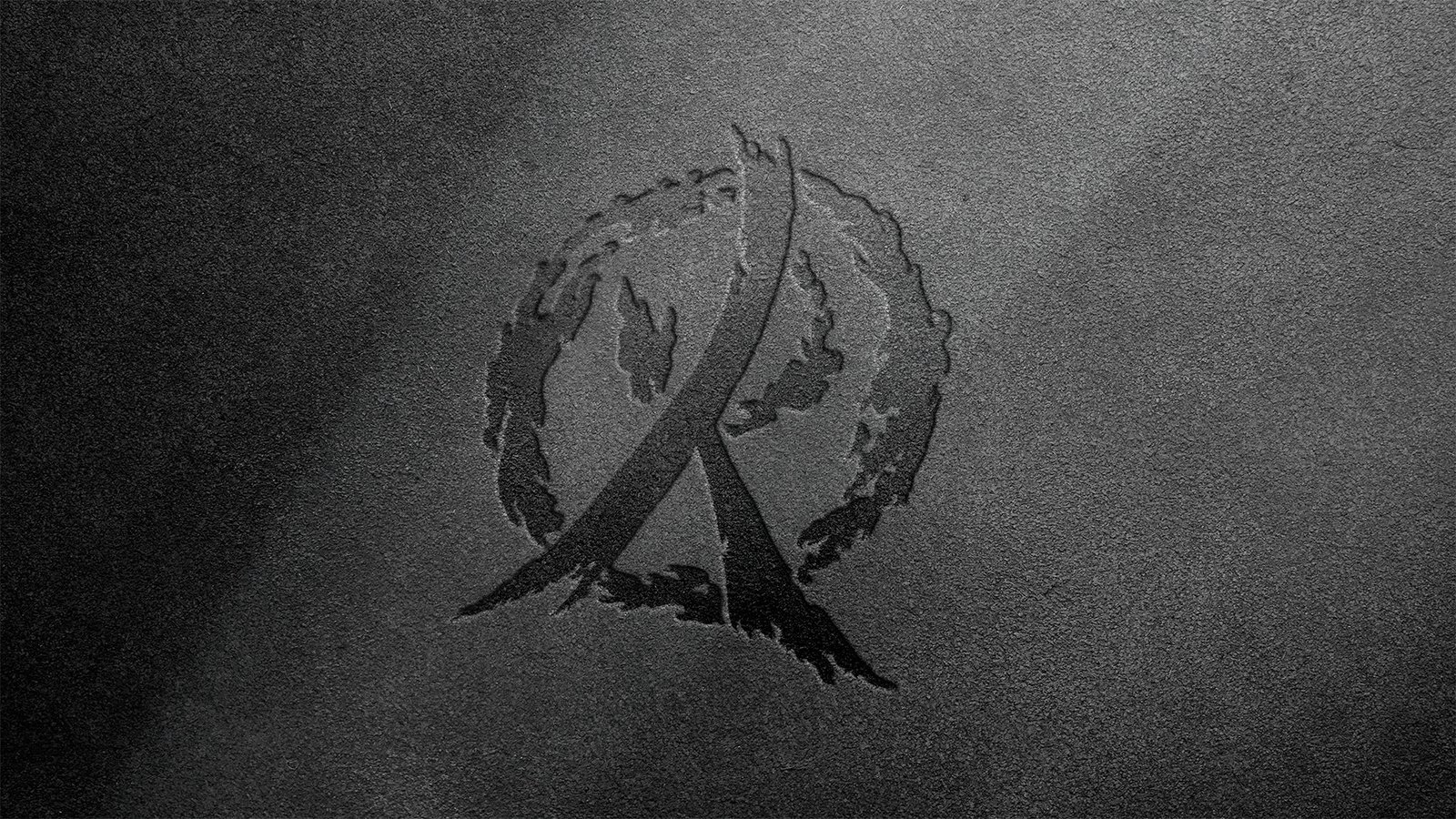
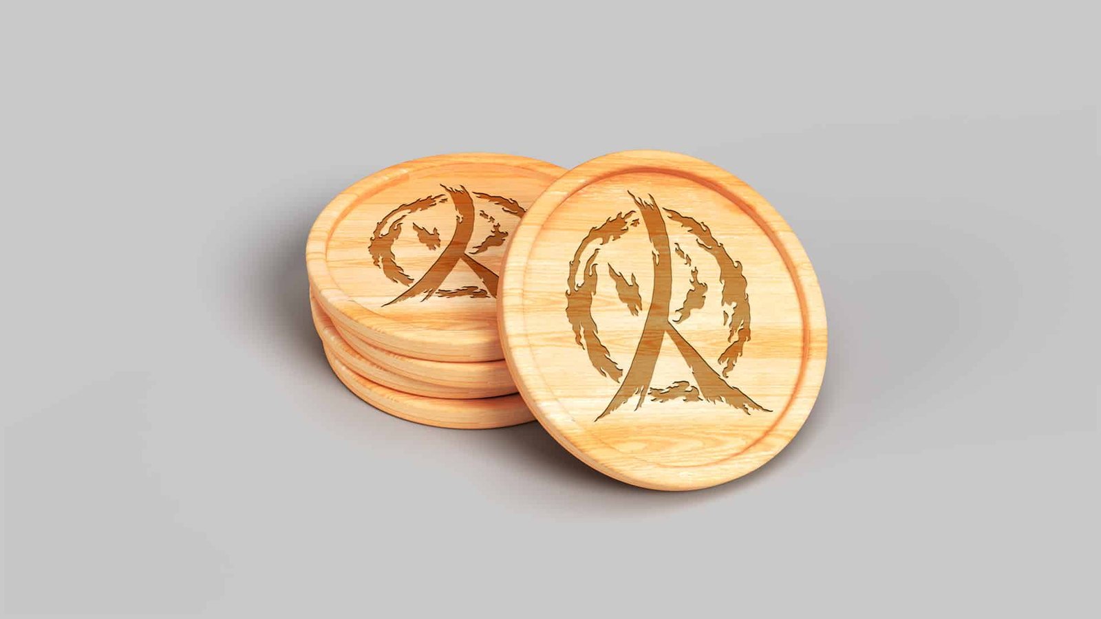
The eyecatching element of this brand is unmistakably the “R” in the title text “FIRE”. The “R” Icon is actually the Japanese character for Fire held together by the ring of fire. The Icon, when placed in the primary logo, has the fire dancing through and around the surrounding letters, unifying the imagery. In this particular instance, the typography was actually chosen as a secondary focus. The Icon size, color and style is meant to draw you in to the remaining part of the logo. This brand is available for purchase.