


Parable Productions is the brainchild of a good friend that has been working in the film industry for years as a production designer and art director for numerous large scale films. Parable Productions was created in order to bring the same level of excellence, expertise and creativity to the Christian market. Storytelling with a mission to affect and change lives. We needed the brand to tell two stories. We needed the brand to bridge the gap between two worlds. We needed the brand to be within reach of those that needed to experience the life changing message that was being delivered.
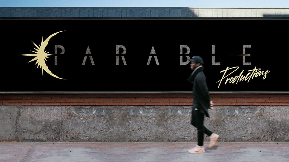
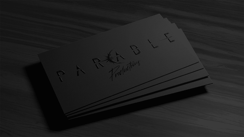
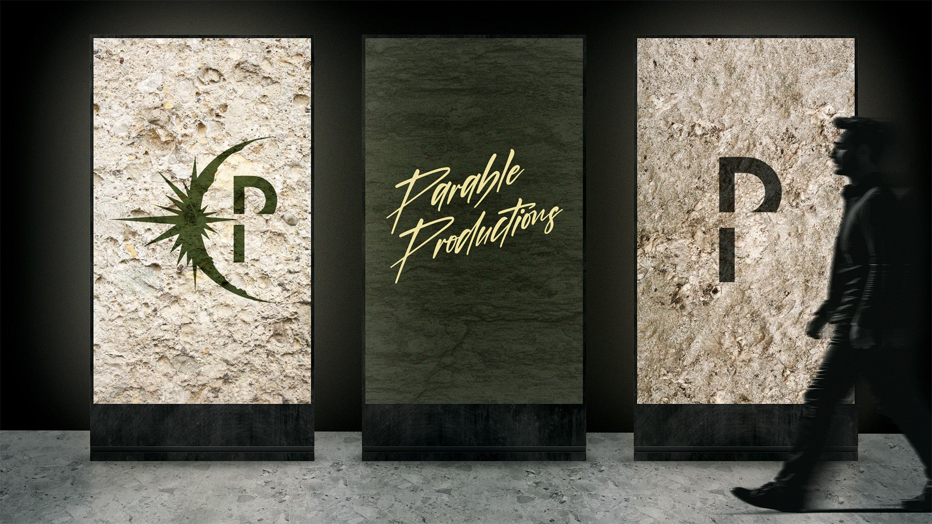
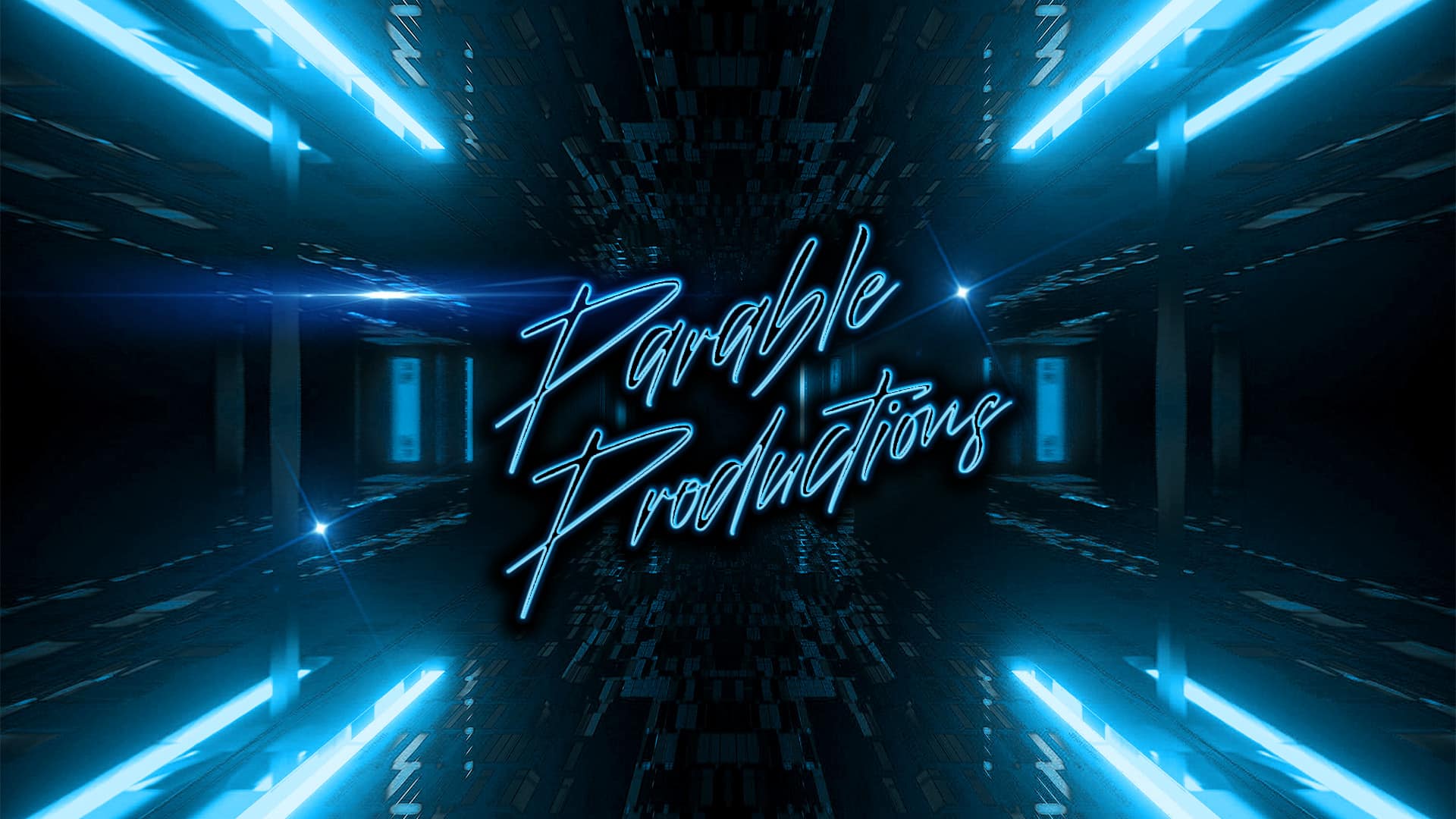
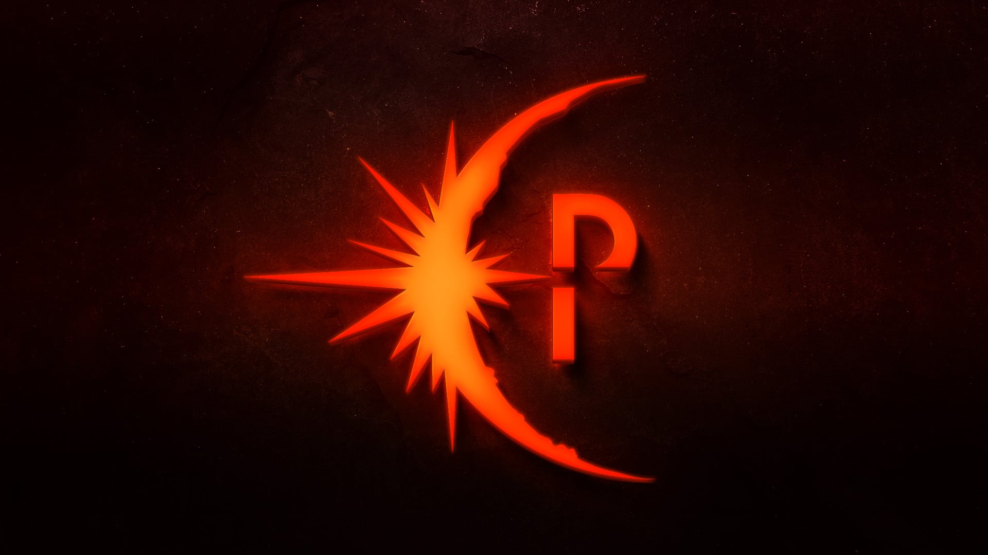
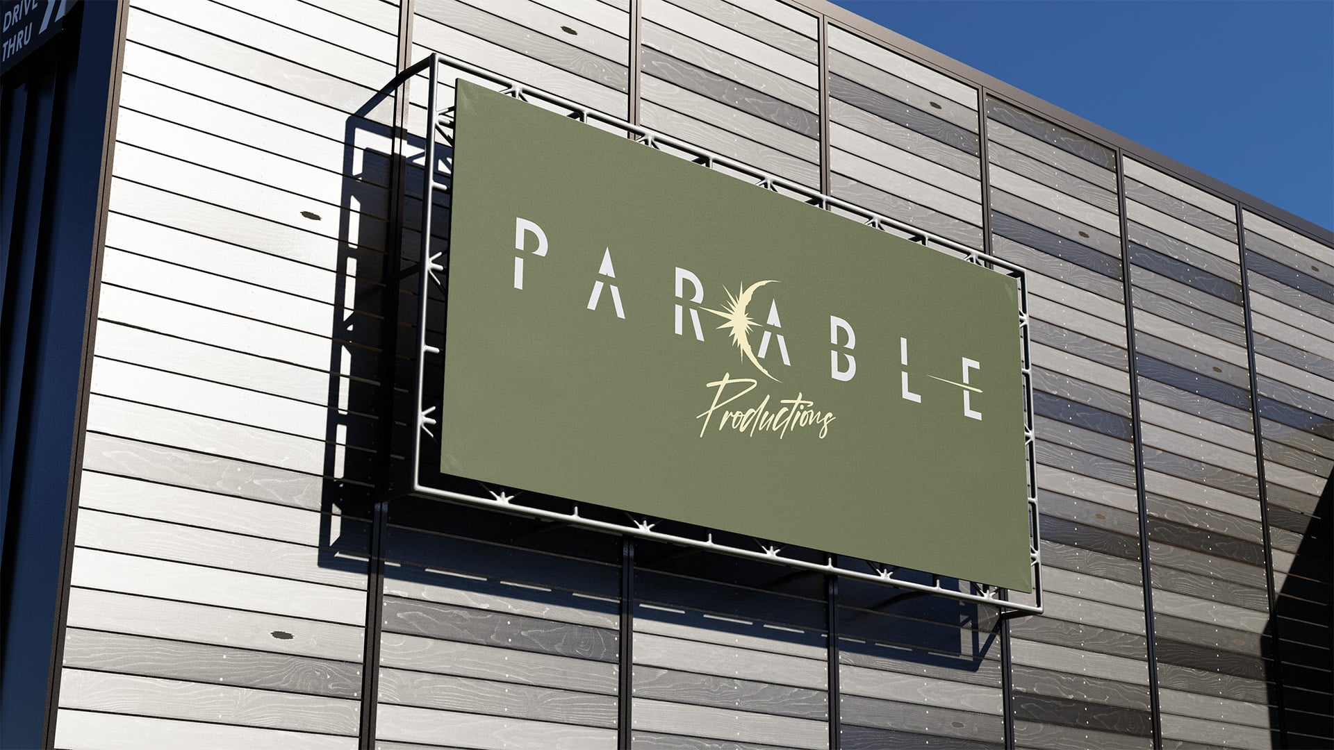
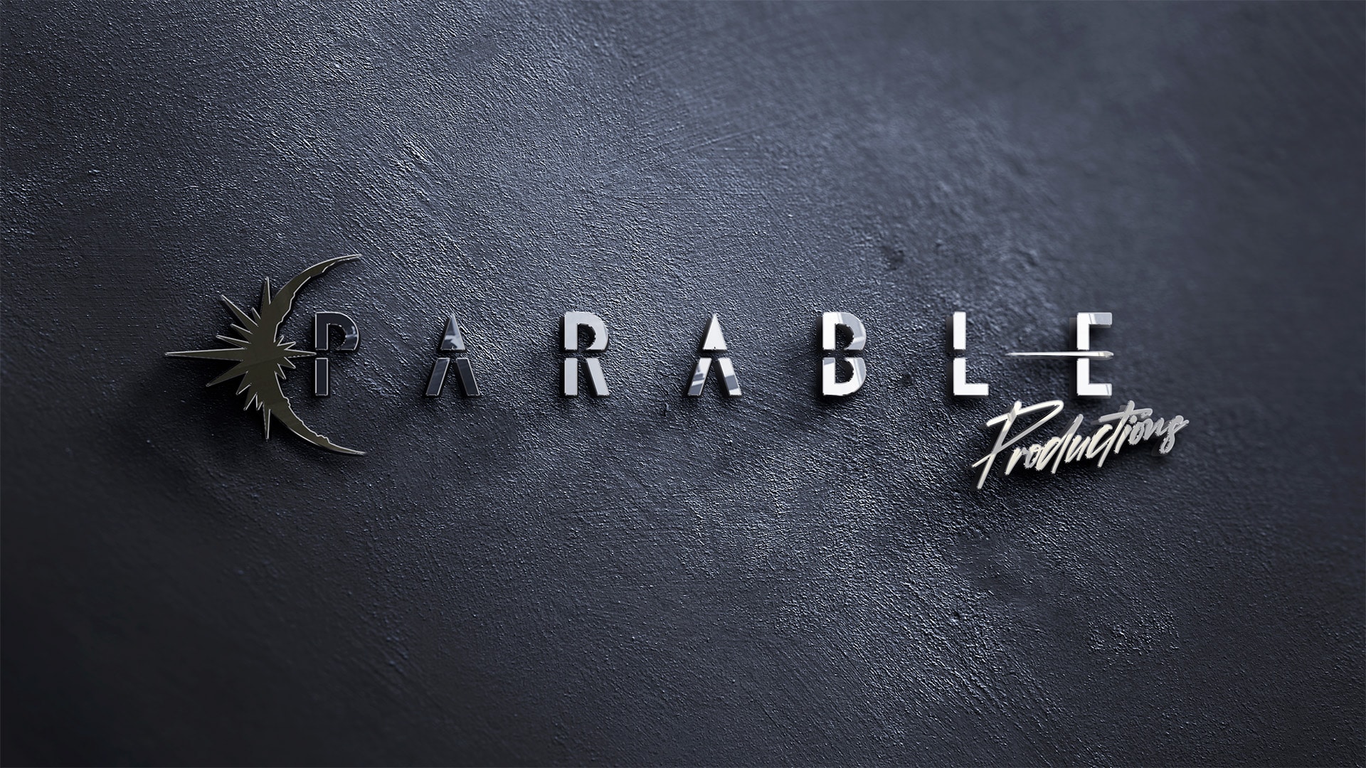
In an effort to create a brand that was able to speak to two different and in some ways, opposite audiences, only connected by one’s love for film, we focused on imagery that could have 2 meanings. To accomplish this, we used the image of a solar eclipse. The eclipse represents the moon moving in front of the sun, the source of light, in order to produce darkness. Through different lenses, you’ll see a symbol of the Resurrection where Jesus, the Light of the World, expels the darkness as “the” source of light. As the stone rolls away a bolt of light emits from the tomb, breaking through the hardened stone typography, revealing the full title and primary logo. A centered and stacked variation of the logo was created for balance. A stand-alone Icon was also created utilizing the crescent shaped light breaking through the “P”. The logo was designed so it could take on the theming of whatever style film was being produced.