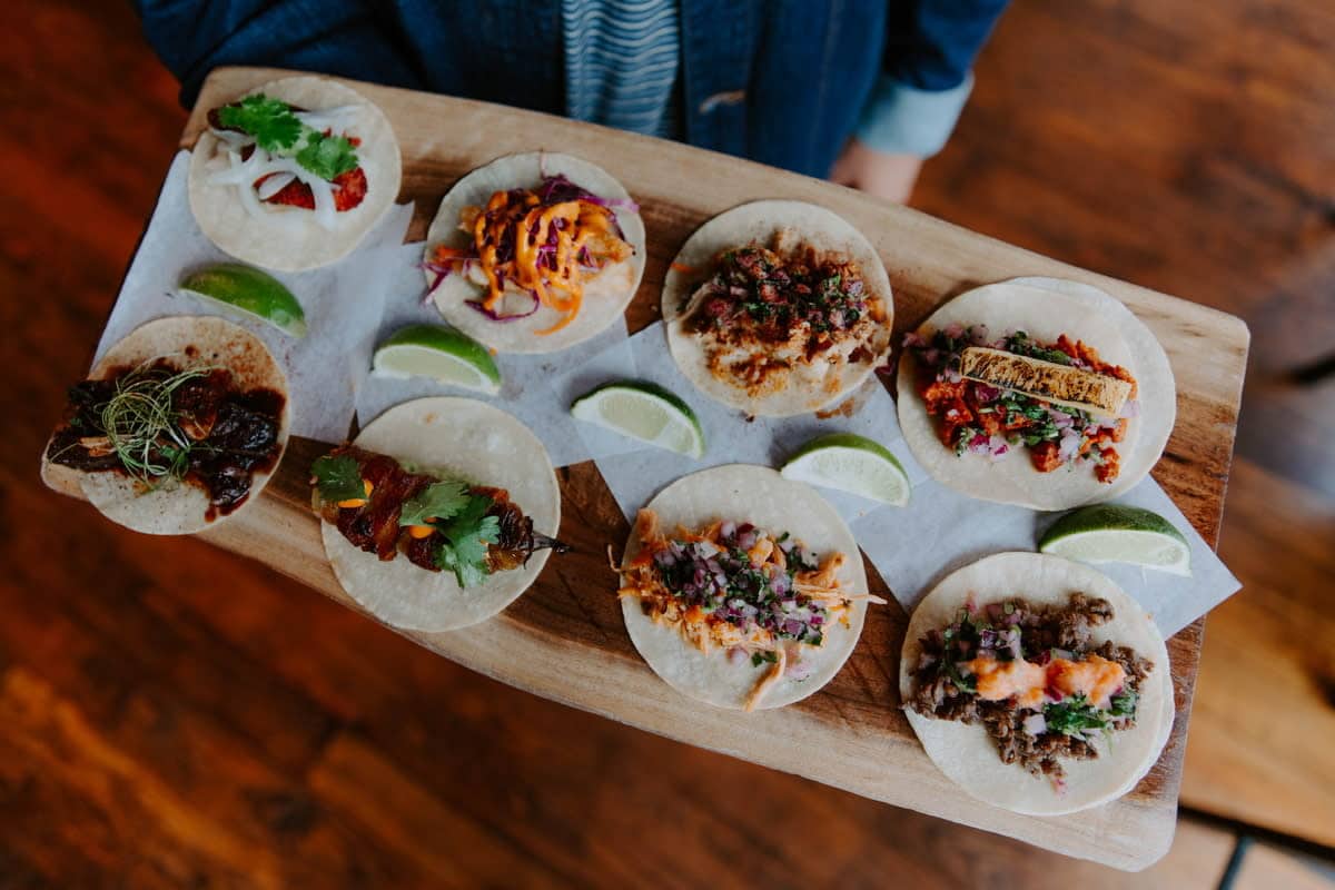


When Tacos x Mezcal approached us, they had been open to the public for over three years. In the initial conversation, we learned two things; they were opening another location in a prominent part of town and there was some confusion with new customers relating to their brand. The logo that they had consisted of the letters “TXMZ”, which was often translated as “TexMex”. However, their cuisine was quite the opposite. Our goal for their rebrand was to eliminate the confusion relating to the style of food that they served without disrupting the already established expectations of their faithful following. Rebranding would also give them everything they needed to launch the new location and to establish themselves as “the destination” for unique, authentic, chef-driven Mexican food.
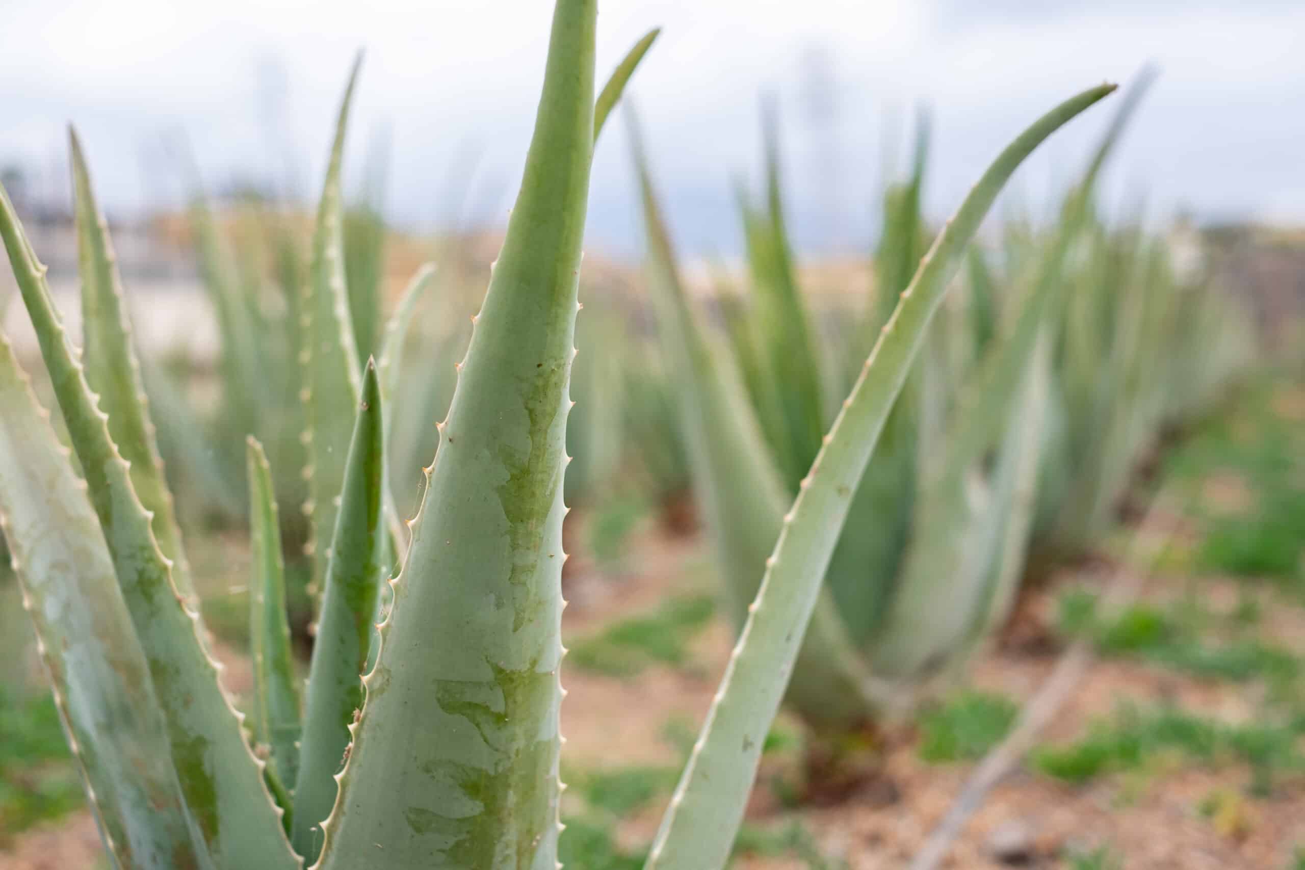
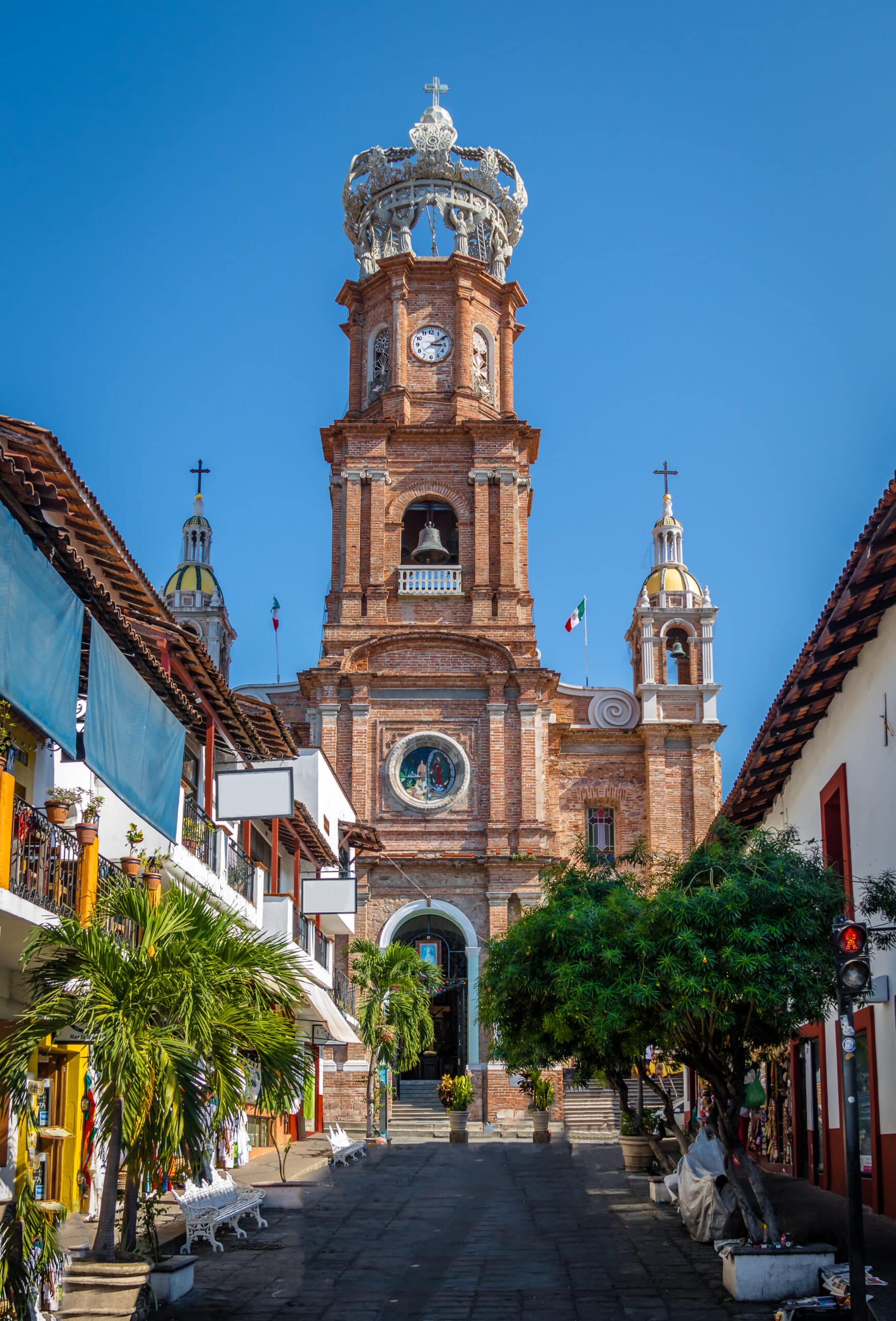
In the development of the TxMZ rebrand, we started by taking elements from the Mexico village that the owners were from, it’s surrounding environments including vegetation, wildlife and culture as overall inspiration for the build. We melded the old world and very organic traits of where they were from with the energetic and moving night life and community focus of the present day restaurant to help establish a brand that represented not just where they came from, but where they were going. After the brand development was complete, we reimagined and developed the assets that would carry the new brand such as exterior signage, staff uniforms and menus.
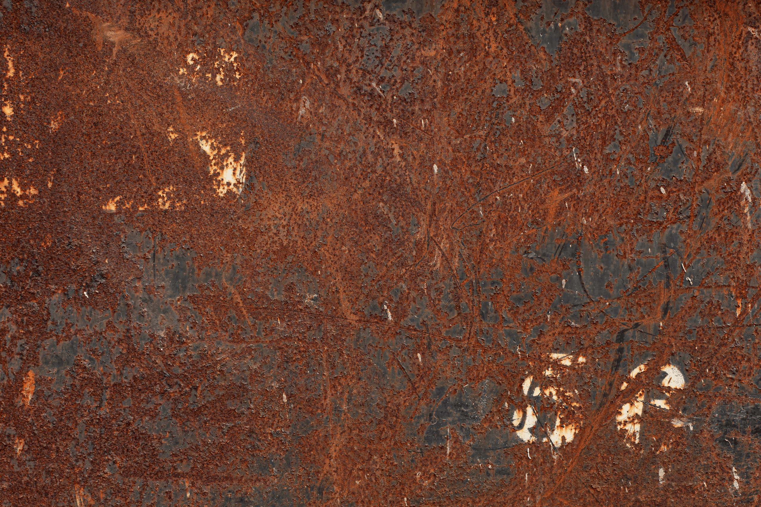
The exterior signage was custom fabricated from 1080 steel and chemically rusted to reflect timelessness and longevity. We sealed the metal in order to lock in the rusting process. Then we added custom programmable LED interior and back lighting in order to create a beacon for nightlife in the heart of Tulsa’s Midtown community.
The Menus were also fully imagined and built from raw, natural materials with the most primary goal being to take the one thing that every single customer will hold in their hands and give it weight, texture, detail and value. We wanted to initiate the “Wow Factor” even before their customer experienced the presentation and quality of the food they were about to eat. The menus were crafted locally at HoldFast Gear because the owner wanted every restaurant location to have a local community feel. We constructed the main menus from cow hide, wood and aged brass. Every menu is a one-off because every cow hide is unique in color and texture. The menu was also designed to be modular so that printed menu pages could be removed and replaced with updates. The Agave Menu is a menu designed solely for their extensive drink list. It was created with leather and paper as the only 2 materials. These menus were taken from the edge of the cow hide in order to give each menu a one-of-a-kind live edge. These were also built to be modular.