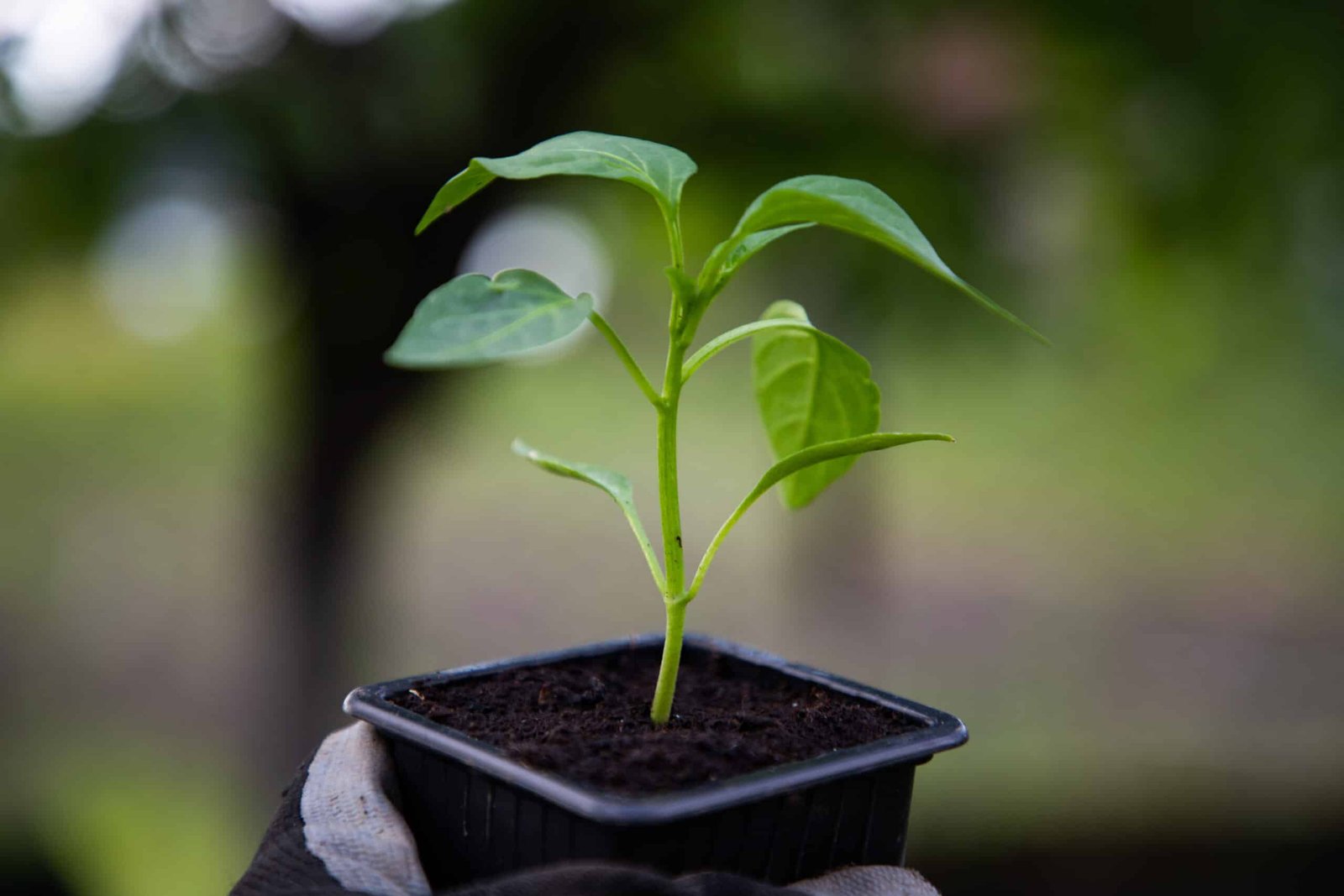


The good people from Advanced Wound Therapy came to us to help them with the brand development of a sister company; Seed Foundation. Seed Foundation is a charitable organization that was built in order to help provide aid to those dealing with both medical and financial burdens. They wanted something that visually told the story behind the idea that when a seed is planted, the foundation of the earth embraces it, holds its roots in place, provides sustenance, and the opportunity to grow and at some point, positions the seed to bear fruit of its own, setting the stage for the cycle to happen all over again. That seed of hope has the power to change lives. It also has the power to spread and become an orchard, providing for the multitudes. This foundation is people helping people, representing a new beginning and restoration.
The Primary logo was constructed to reflect the organic movement of a seed sprouting into a life giving plant. We combined the fluidity of the sprout with the curvature of the typography. The italicization creates movement and gives the impression that the logo is advancing or moving forward. We added a fingerprint as the texture of the seedling itself in order to provide a human touch to the brand. It represents the individual’s responsibility to help those in need. The typography was chosen, not only to show movement and fluidity, but also to make the brand a little bit lighthearted and very approachable. The icon, when used by itself, is slightly tilted to the left to create balance and center your focus. The primary green in the color palette was chosen to provide a direct connection with nature, life and growth while the gold gives the brand elevation and represents the value of giving to others. Showing kindness and engaging with others should be fun. While helping others should be our responsibility, it is also an opportunity that we should all be a part of.